Techsup Rebranding

Ideative Studio2025

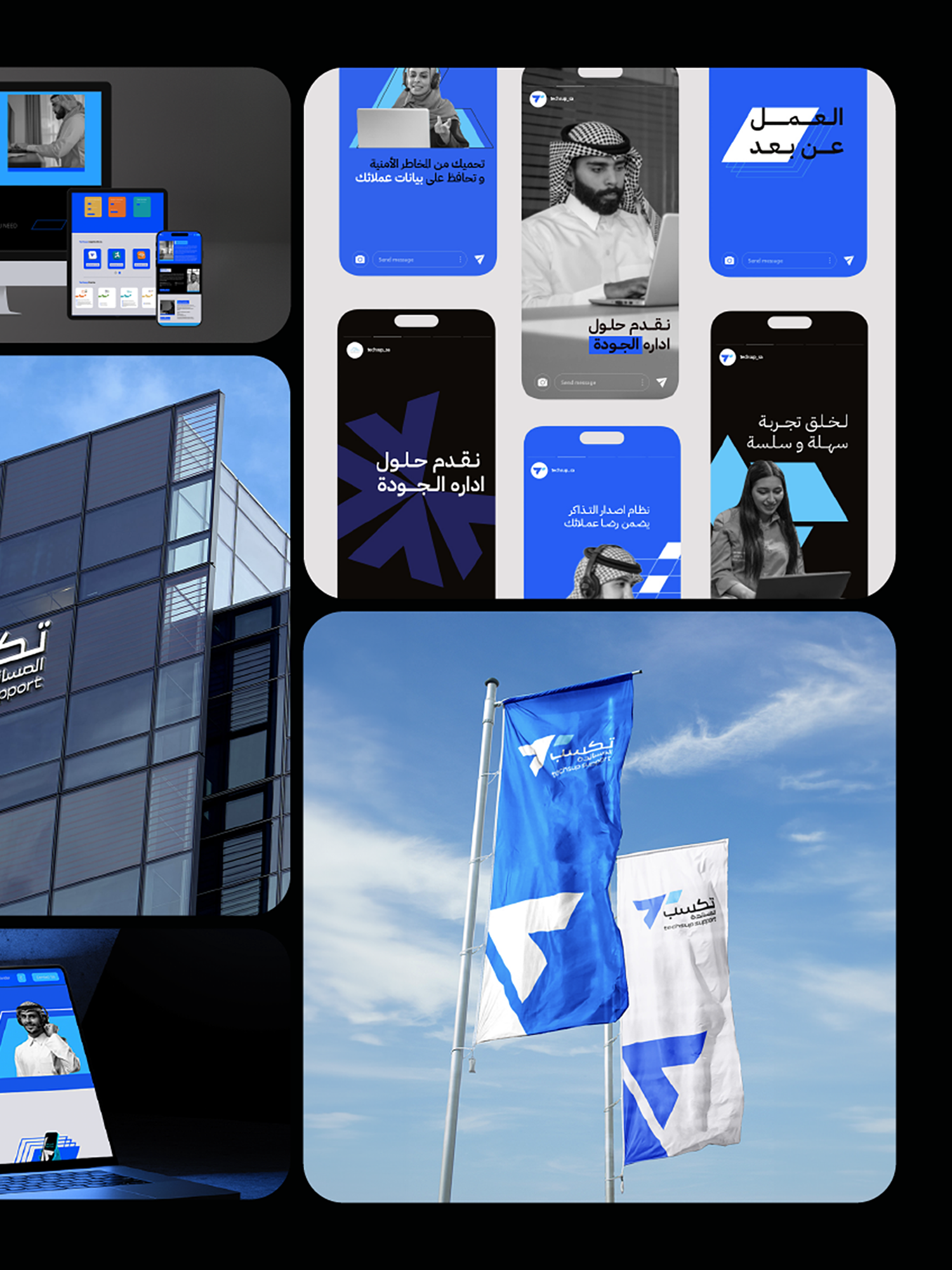
an class="inserted--sup--text inserted--ls--hold false elementor-repeater-item-2d4b6b4" >( Project Goals )an> Ideative Studio led the strategic rebranding of Techsup — a call center and business support company that had outgrown its original identity. As Techsup's service portfolio and client base expanded, the visual brand had fallen behind: it was communicating a smaller, narrower operation than the company had become. The mandate was to close the gap between what Techsup was and how it presented itself to the Saudi business market — particularly in conversations with enterprise-level clients.

We treated this as a positioning exercise before a design exercise. Before any visual work began, we mapped Techsup's current market position against its aspirational position and identified precisely what the rebrand needed to communicate: professional capability, technological sophistication, and the credibility to operate at enterprise scale. The new identity was engineered to shift perception — signalling to the market that Techsup had arrived as a serious contender for large-scale contracts.
( Project Scope )

Leading the full strategic rebranding of Techsup — repositioning a growing call center and business support company to reflect its expanded capabilities and enterprise-level ambitions.

  • Brand audit and competitive positioning analysis
  • Naming review and brand architecture strategy
  • Logo redesign and complete visual identity system
  • Brand guidelines for internal and external application
  • Pitch deck, proposal templates, and corporate communications

( Challenges )

Rebranding an operational business without disrupting client relationships or team confidence required careful navigation. These were the core tensions:

  • ( 001 )
    ( 001 ) Evolving a recognised brand without alienating existing clients who associate the old identity with trust
  • ( 002 )
    ( 002 ) Repositioning from a call center perception toward a full business support partner — a significant shift in brand promise
  • ( 003 )
    ( 003 ) Designing a bilingual identity that carries equal authority in both Arabic and English enterprise communications
  • ( 004 )
    ( 004 ) Building guidelines detailed enough for an internal team to apply consistently without an ongoing agency dependency
  • ( 005 )
    ( 005 ) Delivering the rebrand under business-as-usual operational pressure with no room for extended timelines

(Results )

Techsup's rebrand aligned its external identity with its operational reality — opening conversations at the enterprise level that the previous brand was quietly closing.

  • 1.
    Complete visual identity system reflecting enterprise-level positioning
  • 2.
    Bilingual brand guidelines enabling consistent application across all communications
  • 3.
    Corporate collateral — pitch deck, proposals, and stationery — redesigned to match the new positioning
  • 4.
    Internal team equipped to execute the new brand without ongoing agency dependency
  • 5.
    Client perception elevated, supporting pursuit of larger and more strategic contract opportunities

one ls--default--none" >ontent/uploads/sites/2/2025/10/test_avatar_7.webp">