
Audela Rebranding

Ideative Studio2025

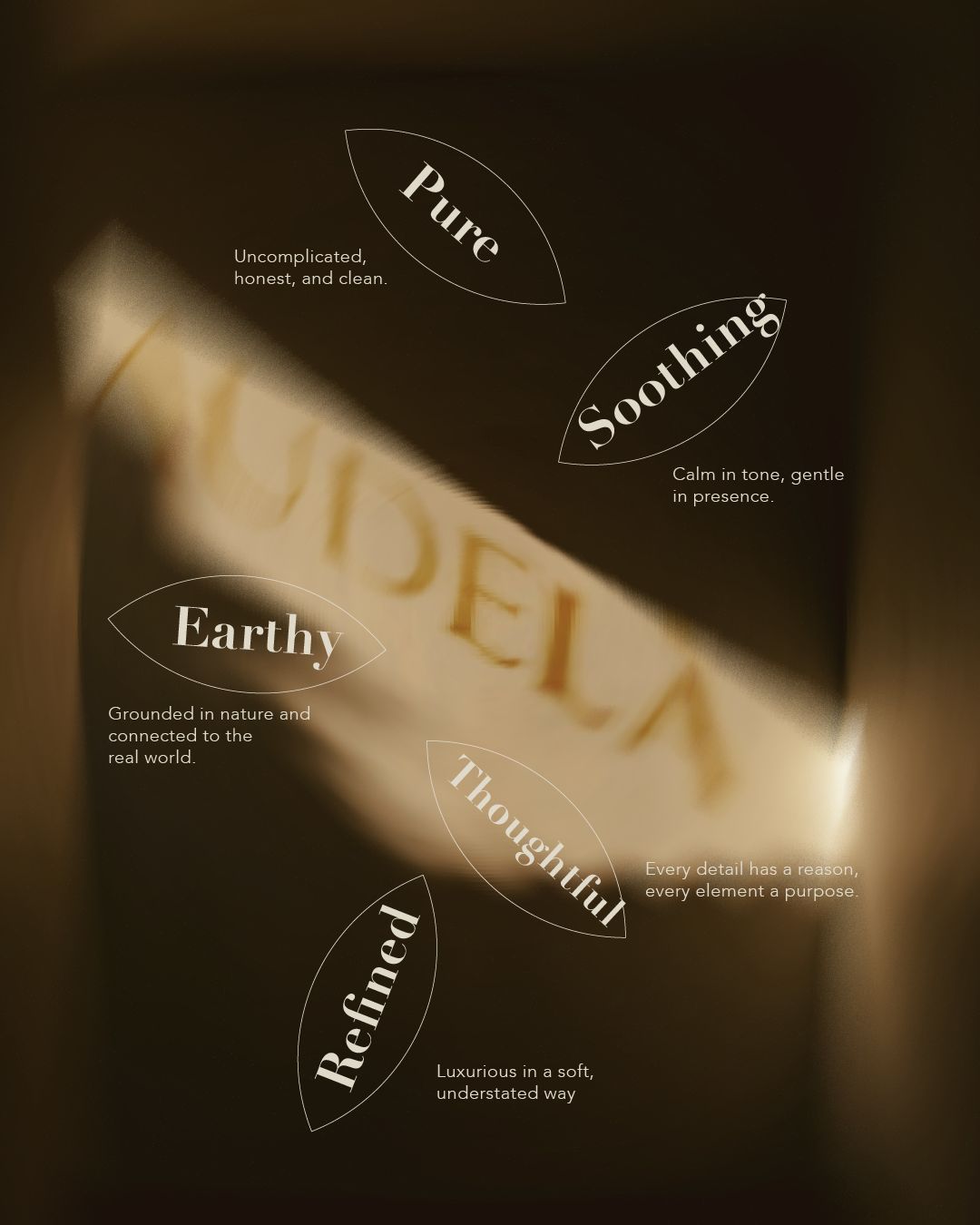
an class="inserted--sup--text inserted--ls--hold false elementor-repeater-item-2d4b6b4" >( Project Goals )an> Audela engaged Ideative Studio to shed an outdated visual identity that no longer reflected the brand's ambitions in the Saudi market. The brief called for a full strategic rebrand — from positioning and naming architecture through to a complete visual identity system. The goal was to reposition Audela as a premium, forward-facing Saudi business capable of competing in a post-Vision 2030 landscape.

Ideative approached the rebrand as a brand-building exercise first and a design exercise second. We began with a discovery phase to understand the competitive landscape, target audience, and long-term business direction before a single mark was sketched. The outcome is a cohesive identity system built to scale — consistent across digital, print, environments, and communications.

( Project Scope )

  • Brand strategy and positioning framework
  • Logo design and identity mark development (primary, secondary, and monogram variants)
  • Full visual identity system: typography, color palette, iconography, and photography direction
  • Brand guidelines document (print and digital standards)
  • Collateral templates: business cards, letterhead, presentation decks, and social media assets

( Challenges )

Every project presents its own complexities. Here is what we navigated:

  • ( 001 )
    Repositioning an established brand without alienating its existing client base — the new identity had to feel like evolution, not replacement
  • ( 002 )
    Designing a bilingual identity system that works equally well in Arabic and English across all touchpoints, from business cards to large-format signage
  • ( 003 )
    Building a flexible visual language that could scale across multiple service verticals without losing coherence

(Results )

Audela launched its new identity to immediate market recognition — the rebrand became the visual foundation for the brand's next growth phase.

  • 1.
    Complete brand identity system delivered — logo, typography, colour palette, Arabic/English lockups, and full brand guidelines
  • 2.
    Brand received immediate positive reception from Audela's existing clients and opened doors to larger enterprise conversations
  • 3.
    Identity system deployed across digital, print, and environmental applications within four weeks of final approval

one ls--default--none" >ontent/uploads/sites/2/2025/10/test_avatar_7.webp">
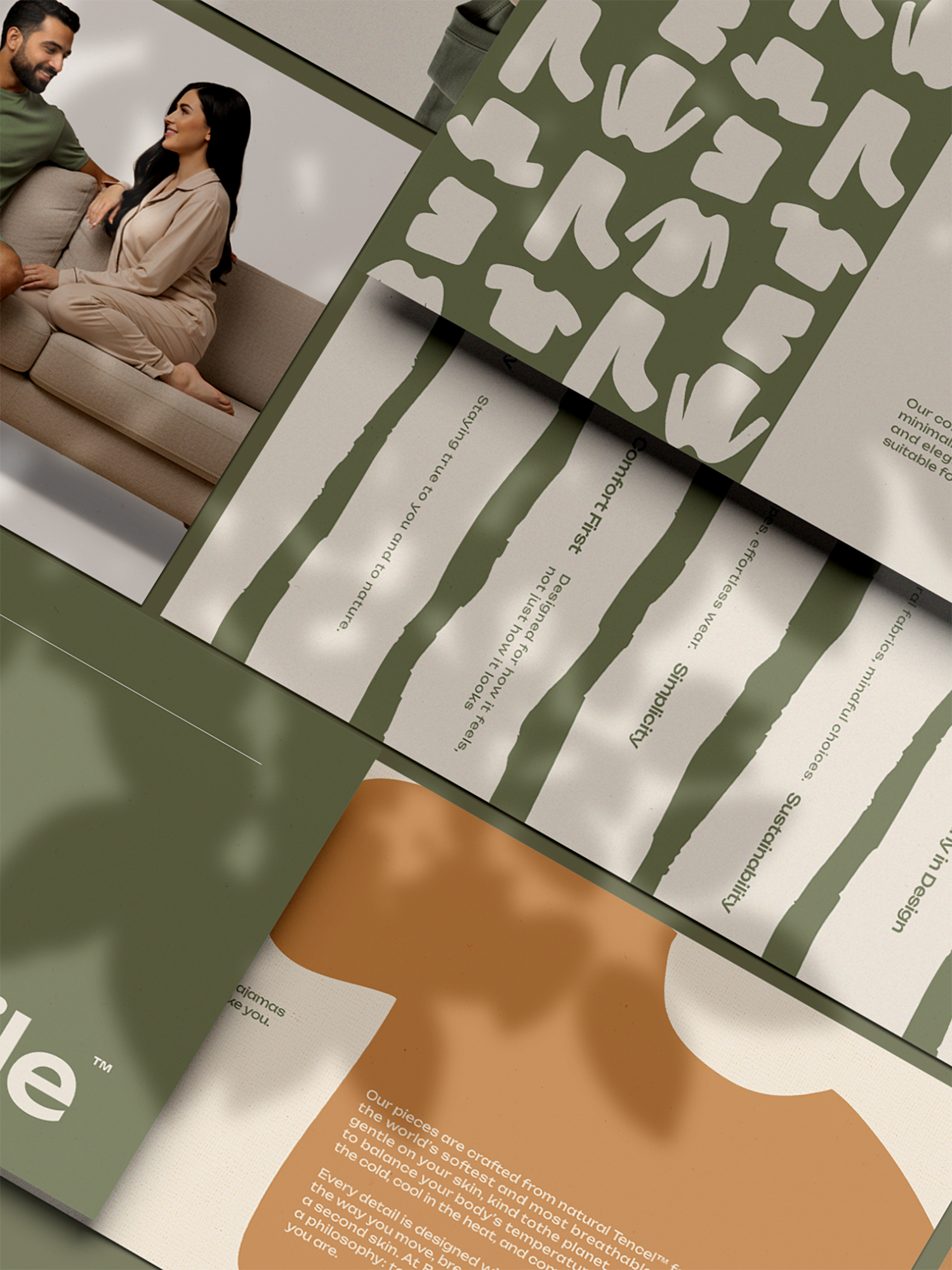
Bo&Be Branding

Ideative Studio2025

an class="inserted--sup--text inserted--ls--hold false elementor-repeater-item-2d4b6b4" >( Project Goals )an> Bo&Be came to Ideative Studio at the very beginning — before a logo, before a color palette, before even a confirmed brand name. The engagement covered the full spectrum of brand creation: naming, identity, tone of voice, and all foundational visual assets required to launch a new consumer brand in the Saudi market.

Building a brand from nothing is the most consequential creative work an agency can do. Ideative approached the Bo&Be project with a structured brand-building methodology: audience definition first, followed by naming workshops, concept development, and iterative identity design. Every decision was tested against the brand's target consumer and the competitive landscape it was entering.

( Project Scope )

  • Brand naming: linguistic analysis, trademark assessment, and Arabic/English compatibility review
  • Brand positioning, personality definition, and tone of voice framework
  • Logo design and primary identity mark across all variant configurations
  • Full visual identity system: color palette, typography, pattern language, and iconography
  • Launch asset pack: social media templates, packaging mockups, and brand guidelines

( Challenges )

Every project presents its own complexities. Here is what we navigated:

  • ( 001 )
    Building a brand identity from zero meant defining the brand's character, values, and visual language before a single design element could be created
  • ( 002 )
    The Bo&Be concept required a name and identity that would resonate with a young, trend-conscious Saudi audience while remaining commercially distinct
  • ( 003 )
    Designing a flexible system that could launch on social media immediately and scale into packaging, retail, and digital environments over time

(Results )

Bo&Be launched with a brand identity strong enough to anchor the business from day one — a complete creative platform built for long-term growth.

  • 1.
    Complete brand identity delivered — naming, logo, colour system, typography, tone of voice, and full brand guidelines
  • 2.
    Brand launched with an immediately coherent visual identity across Instagram, packaging, and marketing materials
  • 3.
    Identity system built to scale — Bo&Be has continued to grow using the same brand foundation, with no need for redesign

one ls--default--none" >ontent/uploads/sites/2/2025/10/test_avatar_7.webp">
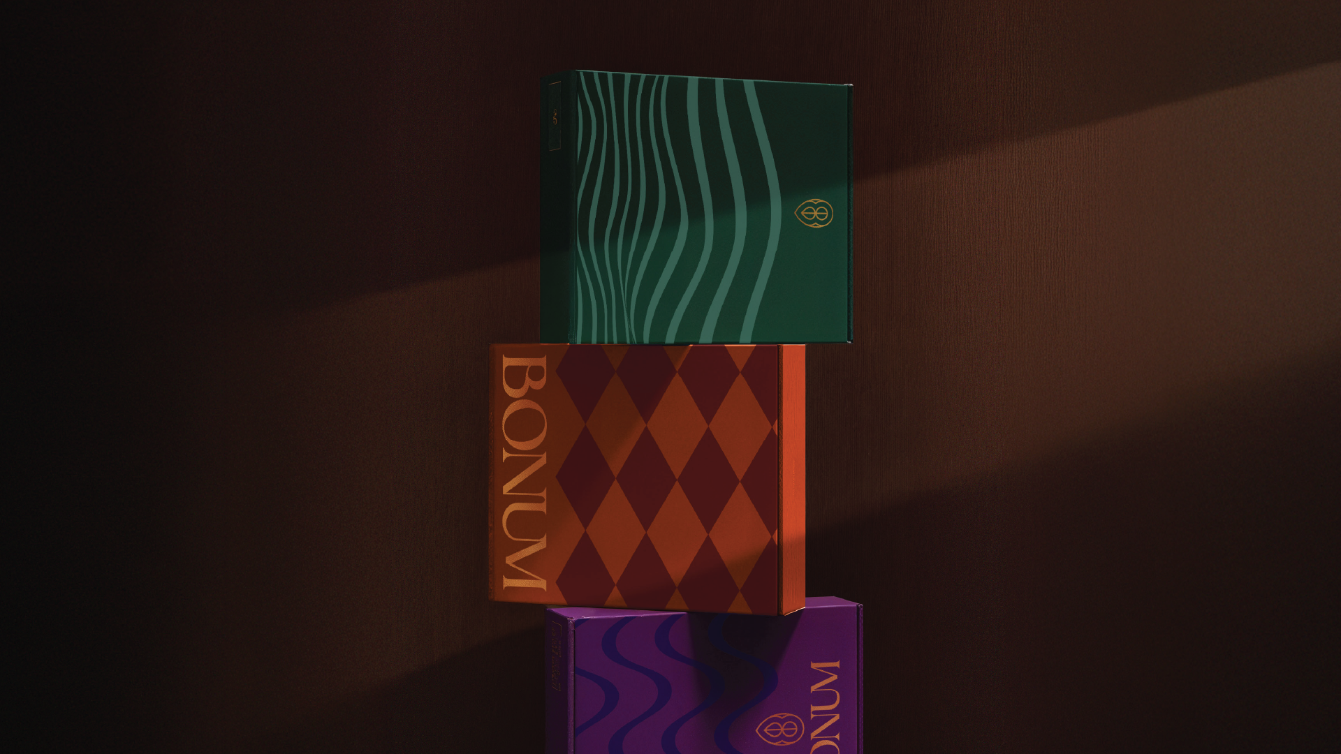
Bonum Chocolates – Branding

Ideative Studio2025

an class="inserted--sup--text inserted--ls--hold false elementor-repeater-item-2d4b6b4" >( Project Goals )an> Bonum Chocolates engaged Ideative Studio to redesign their brand identity and packaging to reflect a true luxury positioning in the Saudi gifting market. The existing identity was underperforming relative to the product quality — the brief called for a complete overhaul of the logo, visual identity, and packaging system to justify premium shelf and gift-box pricing.

Luxury chocolate branding in Saudi Arabia demands a specific kind of restraint: the identity must communicate indulgence, craftsmanship, and heritage without visual noise. Ideative grounded the redesign in a considered aesthetic — refined typography, a sophisticated color system, and packaging architecture designed to elevate the unboxing experience as much as the product itself.

( Project Scope )

  • Brand audit and competitive positioning analysis within the Saudi luxury confectionery market
  • Logo redesign: primary mark, wordmark, and emblem variations
  • Visual identity system: color palette, typography hierarchy, and decorative language
  • Packaging design: individual chocolate wrapping, gift box architecture, and seasonal variants
  • Print-ready artwork for all packaging formats with supplier specifications

( Challenges )

Every project presents its own complexities. Here is what we navigated:

  • ( 001 )
    The Saudi premium confectionery market is sophisticated — positioning Bonum to compete with international luxury chocolate brands required an identity with genuine visual authority
  • ( 002 )
    Packaging design for gifting products must communicate luxury at the point of purchase; every material choice, finish, and typographic decision carries commercial weight
  • ( 003 )
    Creating bilingual packaging that reads as premium in both Arabic and English — a technical and aesthetic challenge most branding projects underestimate

(Results )

Bonum Chocolates emerged from the rebrand with a luxury identity that earns its premium positioning — packaging that sells the product before the customer tastes it.

  • 1.
    Complete brand identity and packaging system delivered — covering the full product range with consistent luxury positioning across all SKUs
  • 2.
    Retail partners responded immediately to the new packaging, with improved shelf placement and sell-through driven by premium visual presentation
  • 3.
    Brand identity extended across gifting boxes, tissue, ribbons, and brand collateral — a cohesive luxury experience from shelf to unboxing

one ls--default--none" >ontent/uploads/sites/2/2025/10/test_avatar_7.webp">

Cucina Di Yass

Ideative Studio2025

an class="inserted--sup--text inserted--ls--hold false elementor-repeater-item-2d4b6b4" >( Project Goals )an> Ideative Studio was commissioned to build a complete brand identity for Cucina Di Yass, a restaurant concept launching an class="underlined inner--element customized--word elementor-repeater-item-27a64e9" >intoan> Riyadh's highly competitive dining scene. The brief was to create a visual language that captured the warmth and personality of the culinary experience — one that would resonate with Saudi diners before the food ever reached the table. Our mandate extended beyond a logo: the brand needed to be a fully functioning system from day one.

We anchored the entire creative process in the restaurant's story — its culinary philosophy, its atmosphere, and the emotional experience it wanted to create for guests. Rather than defaulting to generic F&B aesthetics, we developed a visual identity with genuine character: warm, intentional, and built to perform across every touchpoint a diner might encounter. The system was designed to travel seamlessly from Instagram first-impressions through to in-restaurant signage and packaging.

( Project Scope )

Delivering a complete brand identity for Cucina Di Yass — from naming architecture and logo design to colour palette, typography, packaging, and in-restaurant brand materials.

  • Brand strategy and naming architecture
  • Logo design and visual identity system
  • Colour palette and typography selection
  • Menu design and printed collateral
  • Social media visual templates

( Challenges )

Launching into Riyadh's dining scene means competing against established names with loyal followings. These were our key creative tensions:

  • ( 001 )
    ( 001 ) Standing out in a saturated F&B market without looking like every other casual dining brand
  • ( 002 )
    ( 002 ) Capturing culinary warmth and personality in a visual system that also works at scale
  • ( 003 )
    ( 003 ) Designing bilingual brand assets that feel equally strong in Arabic and English
  • ( 004 )
    ( 004 ) Balancing premium presentation with approachability for a broad Saudi audience
  • ( 005 )
    ( 005 ) Delivering a complete identity system ready for launch across all physical and digital touchpoints

(Results )

Cucina Di Yass launched with a cohesive brand identity that communicated quality and personality from day one — giving the restaurant a visual presence strong enough to earn attention before the first review.

  • 1.
    Complete brand identity system delivered across all touchpoints
  • 2.
    Bilingual logo and visual assets ready for print and digital
  • 3.
    Menu design, packaging, and in-store collateral produced in one unified system
  • 4.
    Social media templates enabling consistent, on-brand content from launch
  • 5.
    Brand perceived as established and premium from first public visibility

one ls--default--none" >ontent/uploads/sites/2/2025/10/test_avatar_7.webp">
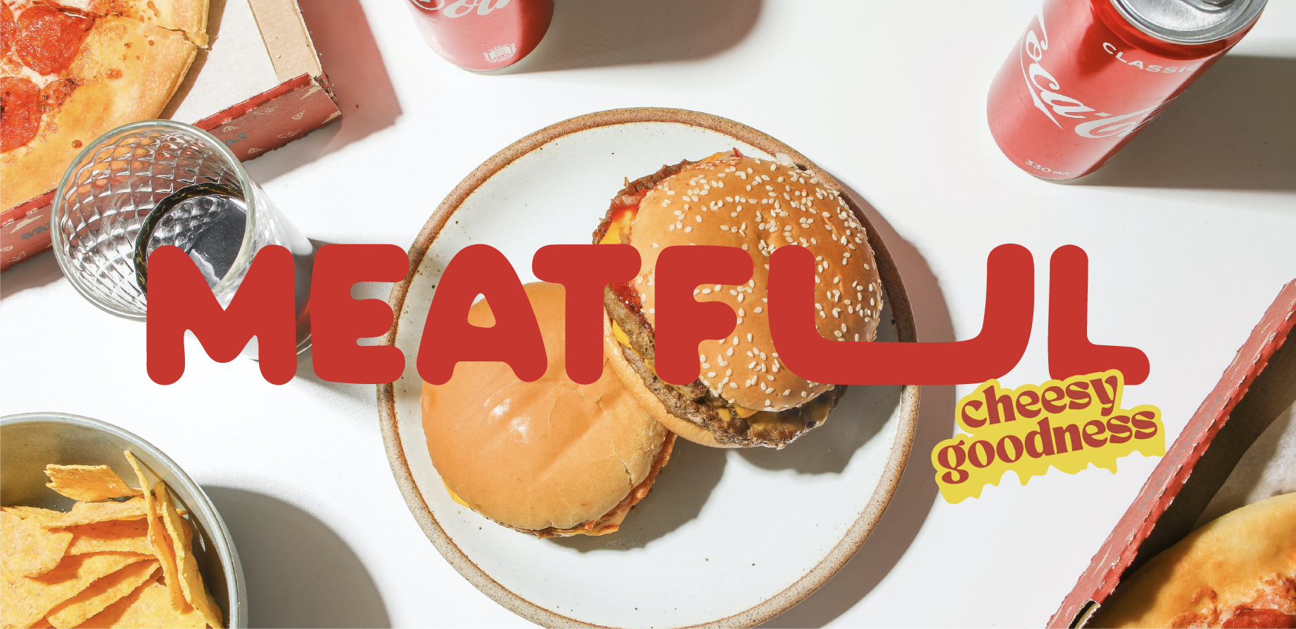
Meatful

Ideative Studio2025

an class="inserted--sup--text inserted--ls--hold false elementor-repeater-item-2d4b6b4" >( Project Goals )an> Ideative Studio was engaged to develop the complete brand identity for Meatful, a bold new entry an class="underlined inner--element customized--word elementor-repeater-item-27a64e9" >intoan> Saudi Arabia's competitive food market. The client needed more than a logo — they needed a brand personality that would register instantly with Saudi food enthusiasts and hold its own in an environment where new concepts launch and fade every week. The brief was clear: create something impossible to ignore.

We leaned into Meatful's personality from the first briefing session — this wasn't a brand that called for restraint. The creative direction centred on confident, high-energy visual language: assertive typography, a colour palette that communicates appetite and intensity, and graphic elements with enough boldness to stand out in a saturated feed. Every decision was made with the Saudi market's visual literacy in mind — an audience that has seen every generic food brand template and responds to something that genuinely has character.

( Project Scope )

Building the complete brand identity for Meatful — a bold, high-energy food brand entering Saudi Arabia's competitive market and needing a visual system as confident as its product.

  • Brand strategy and positioning for the Saudi F&B market
  • Logo design and visual identity system
  • Packaging design and label system
  • Brand voice and tone guidelines
  • Social media identity and content templates

( Challenges )

Meatful needed to make an immediate impression in a market full of visually aggressive food brands. These were the creative challenges:

  • ( 001 )
    ( 001 ) Differentiating from established meat-centric brands without defaulting to the same visual codes
  • ( 002 )
    ( 002 ) Building a brand personality bold enough to attract attention but considered enough to retain trust
  • ( 003 )
    ( 003 ) Creating a bilingual identity that carries the same energy in Arabic and English
  • ( 004 )
    ( 004 ) Designing packaging that works across multiple product formats without losing brand coherence
  • ( 005 )
    ( 005 ) Establishing a distinctive brand voice that translates consistently across social media and physical materials

(Results )

Meatful entered the Saudi food scene with an identity so distinct it became a talking point — the brand itself as much a product as the food it represents.

  • 1.
    Complete brand identity system with full bilingual execution
  • 2.
    Packaging system designed for scalability across the product range
  • 3.
    Social media templates enabling immediate on-brand content production
  • 4.
    Brand recognised as a category standout from first market appearance
  • 5.
    Visual language that differentiates confidently from category norms

one ls--default--none" >ontent/uploads/sites/2/2025/10/test_avatar_7.webp">
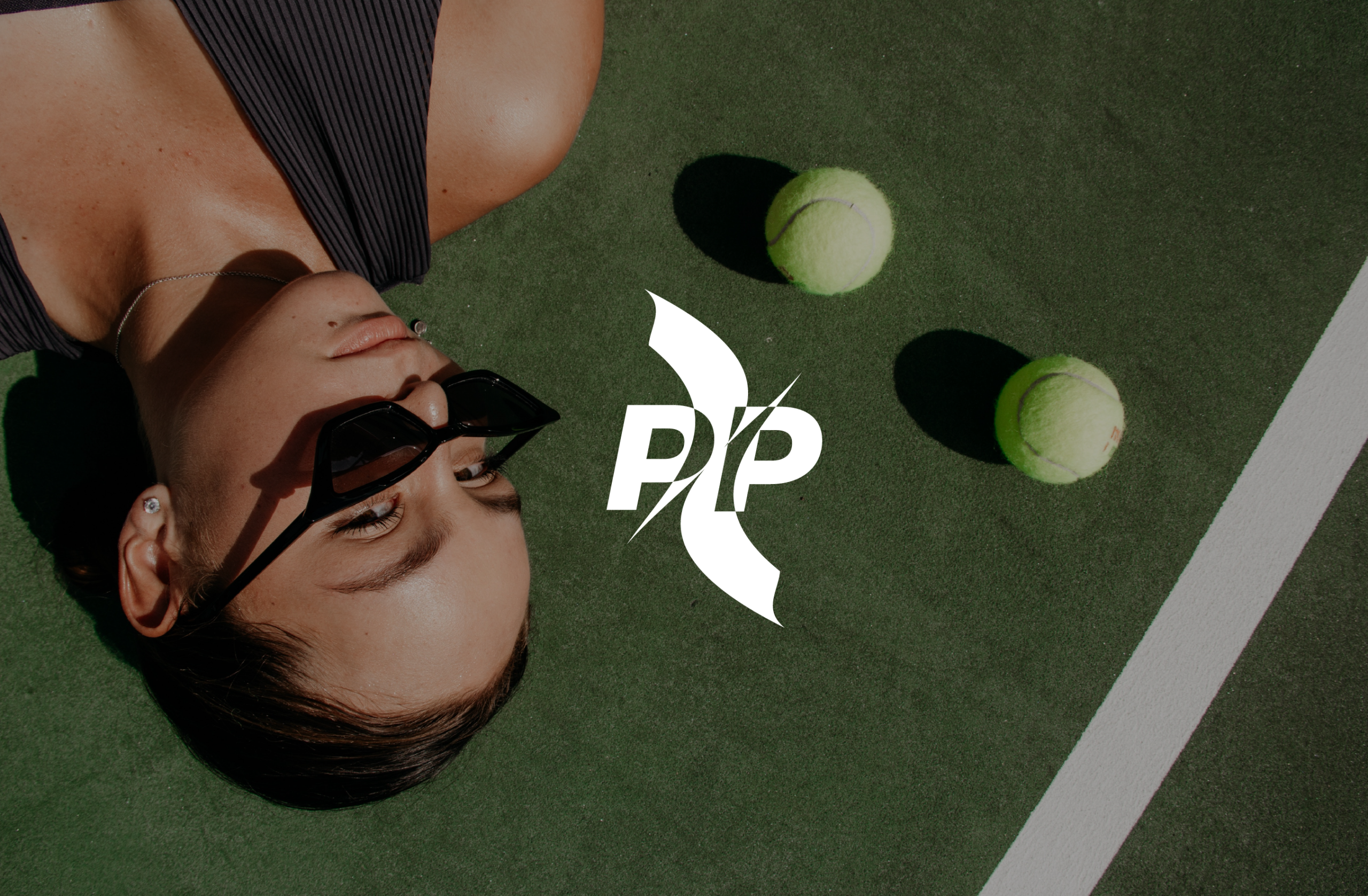
Padel Pulse

Ideative Studio2025

an class="inserted--sup--text inserted--ls--hold false elementor-repeater-item-2d4b6b4" >( Project Goals )an> Ideative Studio was tasked with creating the brand identity for Padel Pulse, a brand being built at the intersection of sport and lifestyle in one of Saudi Arabia's fastest-growing communities. Padel has moved beyond a sport — it is a social culture, and Padel Pulse needed an identity that spoke to that culture with credibility. The brief was to design a brand that athletes and lifestyle enthusiasts would actually want to wear, follow, and associate with.

We researched the Saudi padel community before touching a single design element — understanding what drives participation, what brands the community already respects, and where the visual white space existed. The creative direction landed at the intersection of sport precision and lifestyle confidence: dynamic enough for the court, polished enough for the feed. Graphic elements drew from the geometry of padel itself, and the colour system was chosen to communicate speed, energy, and premium quality simultaneously.

( Project Scope )

Creating the brand identity for Padel Pulse — a lifestyle and sports brand built at the intersection of Saudi Arabia's fastest-growing recreational community and premium streetwear aesthetics.

  • Brand strategy and community positioning research
  • Logo design and visual identity system
  • Colour system and typography for sport and lifestyle contexts
  • Apparel and equipment branding applications
  • Social media visual identity and content direction

( Challenges )

Padel sits at the intersection of elite sport and social lifestyle — the brand had to be credible in both worlds. Here is what that required:

  • ( 001 )
    ( 001 ) Earning credibility in a community where players already know and respect international padel brands
  • ( 002 )
    ( 002 ) Building a visual identity that works on court, on apparel, and on social media simultaneously
  • ( 003 )
    ( 003 ) Capturing Saudi padel culture specifically — not a generic sports aesthetic imported from Europe
  • ( 004 )
    ( 004 ) Designing a system flexible enough for event graphics, merchandise, and digital content without losing cohesion
  • ( 005 )
    ( 005 ) Positioning as a lifestyle brand while maintaining the performance associations the sport demands

(Results )

Padel Pulse launched with a brand identity the community immediately took seriously — a voice that felt native to Saudi padel culture from the very first post.

  • 1.
    Brand identity system adopted consistently across all community touchpoints from launch
  • 2.
    Strong visual differentiation from international padel brands established on social media
  • 3.
    Apparel and merchandise branding delivered with full production-ready specifications
  • 4.
    Community recognition and organic engagement from launch without paid promotion
  • 5.
    Brand perceived as premium and locally rooted — a rare combination in Saudi sports branding

one ls--default--none" >ontent/uploads/sites/2/2025/10/test_avatar_7.webp">
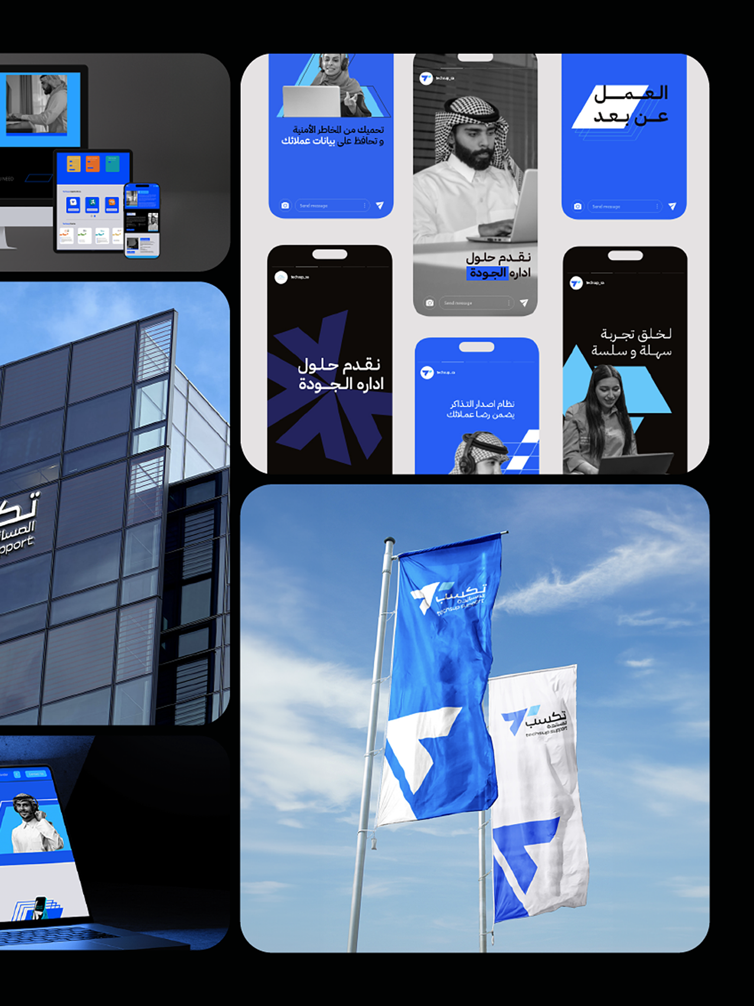
Techsup Rebranding

Ideative Studio2025

an class="inserted--sup--text inserted--ls--hold false elementor-repeater-item-2d4b6b4" >( Project Goals )an> Ideative Studio led the strategic rebranding of Techsup — a call center and business support company that had outgrown its original identity. As Techsup's service portfolio and client base expanded, the visual brand had fallen behind: it was communicating a smaller, narrower operation than the company had become. The mandate was to close the gap between what Techsup was and how it presented itself to the Saudi business market — particularly in conversations with enterprise-level clients.

We treated this as a positioning exercise before a design exercise. Before any visual work began, we mapped Techsup's current market position against its aspirational position and identified precisely what the rebrand needed to communicate: professional capability, technological sophistication, and the credibility to operate at enterprise scale. The new identity was engineered to shift perception — signalling to the market that Techsup had arrived as a serious contender for large-scale contracts.

( Project Scope )

Leading the full strategic rebranding of Techsup — repositioning a growing call center and business support company to reflect its expanded capabilities and enterprise-level ambitions.

  • Brand audit and competitive positioning analysis
  • Naming review and brand architecture strategy
  • Logo redesign and complete visual identity system
  • Brand guidelines for internal and external application
  • Pitch deck, proposal templates, and corporate communications

( Challenges )

Rebranding an operational business without disrupting client relationships or team confidence required careful navigation. These were the core tensions:

  • ( 001 )
    ( 001 ) Evolving a recognised brand without alienating existing clients who associate the old identity with trust
  • ( 002 )
    ( 002 ) Repositioning from a call center perception toward a full business support partner — a significant shift in brand promise
  • ( 003 )
    ( 003 ) Designing a bilingual identity that carries equal authority in both Arabic and English enterprise communications
  • ( 004 )
    ( 004 ) Building guidelines detailed enough for an internal team to apply consistently without an ongoing agency dependency
  • ( 005 )
    ( 005 ) Delivering the rebrand under business-as-usual operational pressure with no room for extended timelines

(Results )

Techsup's rebrand aligned its external identity with its operational reality — opening conversations at the enterprise level that the previous brand was quietly closing.

  • 1.
    Complete visual identity system reflecting enterprise-level positioning
  • 2.
    Bilingual brand guidelines enabling consistent application across all communications
  • 3.
    Corporate collateral — pitch deck, proposals, and stationery — redesigned to match the new positioning
  • 4.
    Internal team equipped to execute the new brand without ongoing agency dependency
  • 5.
    Client perception elevated, supporting pursuit of larger and more strategic contract opportunities

one ls--default--none" >ontent/uploads/sites/2/2025/10/test_avatar_7.webp">