



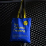
We anchored the entire creative process in the restaurant's story — its culinary philosophy, its atmosphere, and the emotional experience it wanted to create for guests. Rather than defaulting to generic F&B aesthetics, we developed a visual identity with genuine character: warm, intentional, and built to perform across every touchpoint a diner might encounter. The system was designed to travel seamlessly from Instagram first-impressions through to in-restaurant signage and packaging.
( Project Scope )
Delivering a complete brand identity for Cucina Di Yass — from naming architecture and logo design to colour palette, typography, packaging, and in-restaurant brand materials.
( Challenges )
Launching into Riyadh's dining scene means competing against established names with loyal followings. These were our key creative tensions:
(Results )
Cucina Di Yass launched with a cohesive brand identity that communicated quality and personality from day one — giving the restaurant a visual presence strong enough to earn attention before the first review.
one ls--default--none" >
ontent/uploads/sites/2/2025/10/test_avatar_7.webp">
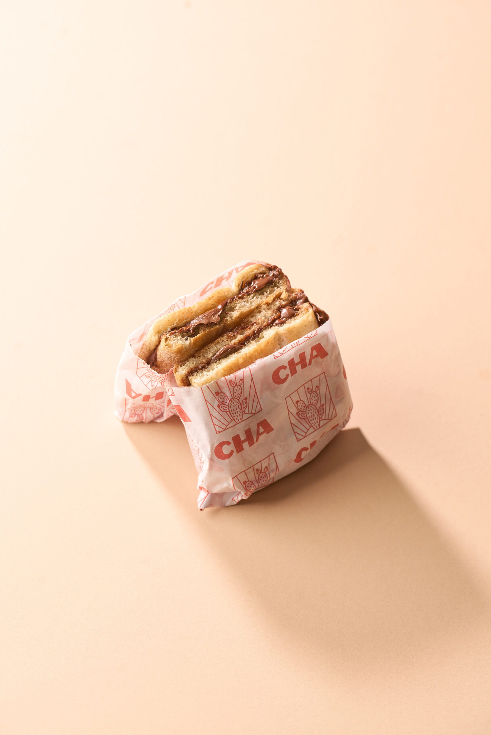
We approached the shoot with the delivery app UI as the primary frame of reference — every composition, lighting decision, and styling choice was made with small-screen performance in mind. Bold, well-lit frames that read clearly at 200 pixels. Colour accuracy that represents dishes as they actually arrive. Consistent visual treatment across the entire menu to create a listing that communicates quality and trustworthiness at a glance.
( Project Scope )
Producing a complete suite of food photography for Cha, purpose-built for performance on Saudi delivery platforms — HungerStation, Jahez, and ToYou.
( Challenges )
Delivery app photography has a specific performance brief that goes beyond aesthetics. These were the tensions we had to resolve:
(Results )
Cha's delivery app listings went from functional to standout — professional imagery that converts browsers into buyers at the exact moment the decision is made.
one ls--default--none" >
ontent/uploads/sites/2/2025/10/test_avatar_7.webp">
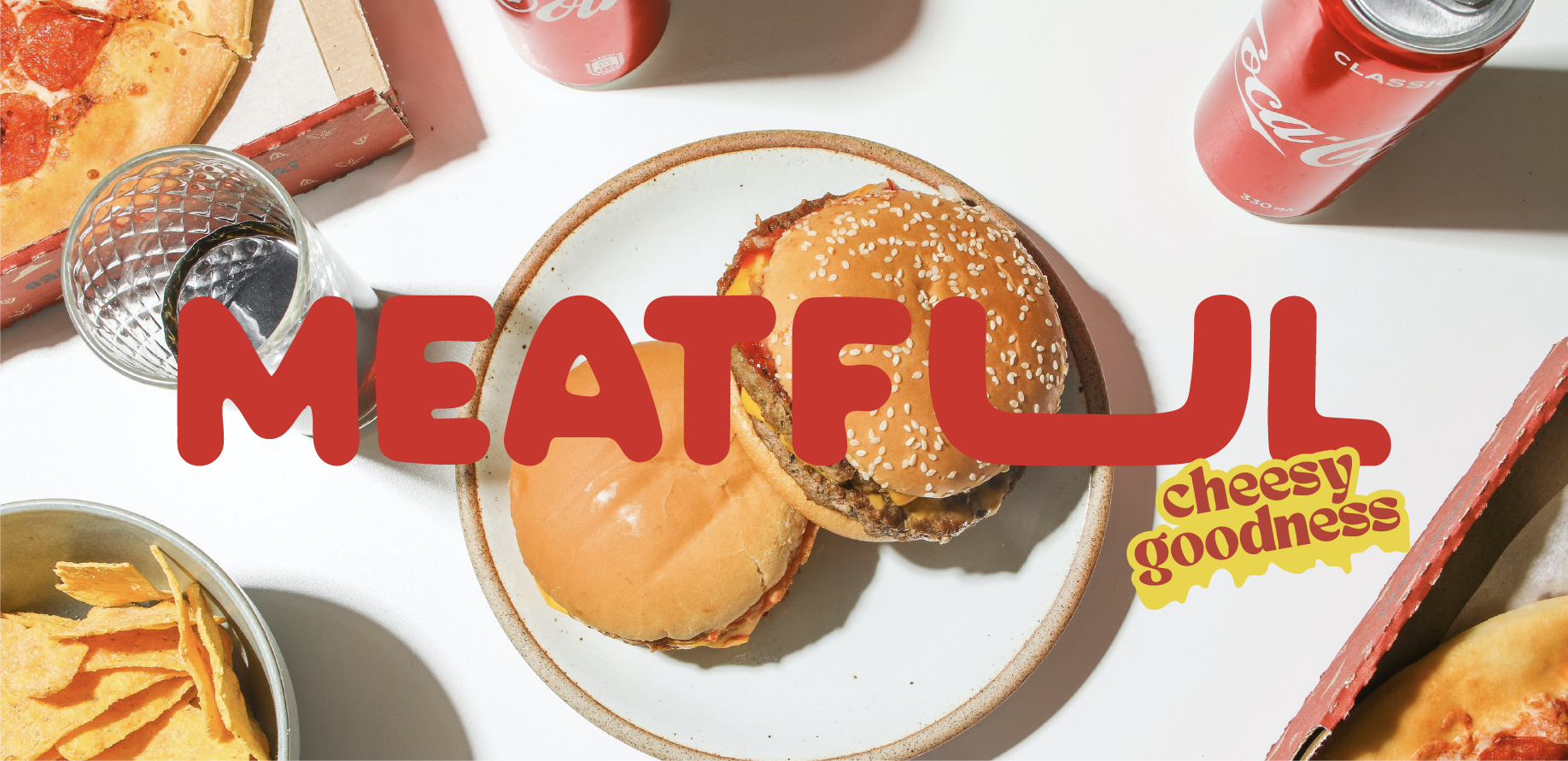
We leaned into Meatful's personality from the first briefing session — this wasn't a brand that called for restraint. The creative direction centred on confident, high-energy visual language: assertive typography, a colour palette that communicates appetite and intensity, and graphic elements with enough boldness to stand out in a saturated feed. Every decision was made with the Saudi market's visual literacy in mind — an audience that has seen every generic food brand template and responds to something that genuinely has character.
( Project Scope )
Building the complete brand identity for Meatful — a bold, high-energy food brand entering Saudi Arabia's competitive market and needing a visual system as confident as its product.
( Challenges )
Meatful needed to make an immediate impression in a market full of visually aggressive food brands. These were the creative challenges:
(Results )
Meatful entered the Saudi food scene with an identity so distinct it became a talking point — the brand itself as much a product as the food it represents.
one ls--default--none" >
ontent/uploads/sites/2/2025/10/test_avatar_7.webp">
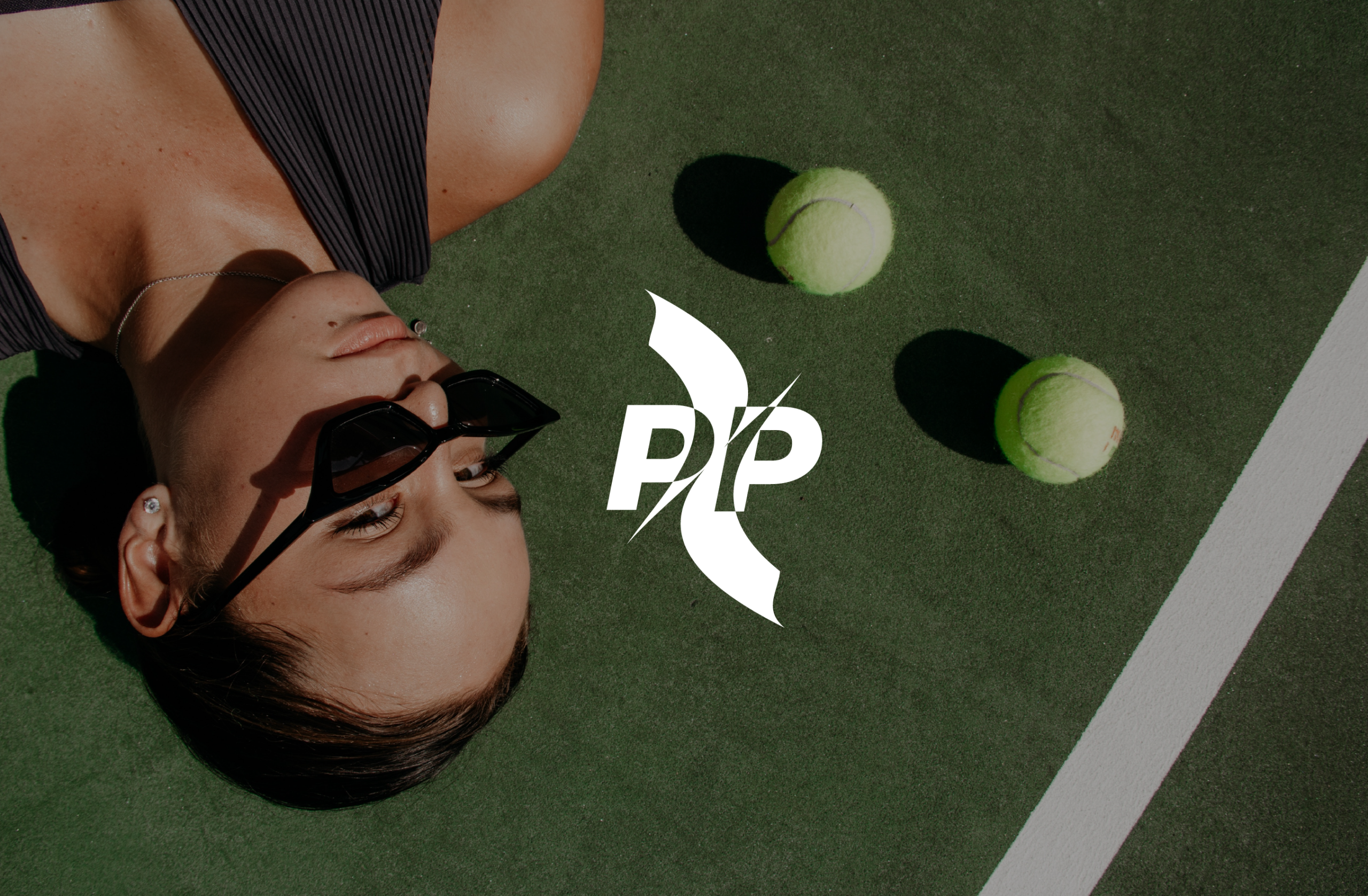
We researched the Saudi padel community before touching a single design element — understanding what drives participation, what brands the community already respects, and where the visual white space existed. The creative direction landed at the intersection of sport precision and lifestyle confidence: dynamic enough for the court, polished enough for the feed. Graphic elements drew from the geometry of padel itself, and the colour system was chosen to communicate speed, energy, and premium quality simultaneously.
( Project Scope )
Creating the brand identity for Padel Pulse — a lifestyle and sports brand built at the intersection of Saudi Arabia's fastest-growing recreational community and premium streetwear aesthetics.
( Challenges )
Padel sits at the intersection of elite sport and social lifestyle — the brand had to be credible in both worlds. Here is what that required:
(Results )
Padel Pulse launched with a brand identity the community immediately took seriously — a voice that felt native to Saudi padel culture from the very first post.
one ls--default--none" >
ontent/uploads/sites/2/2025/10/test_avatar_7.webp">
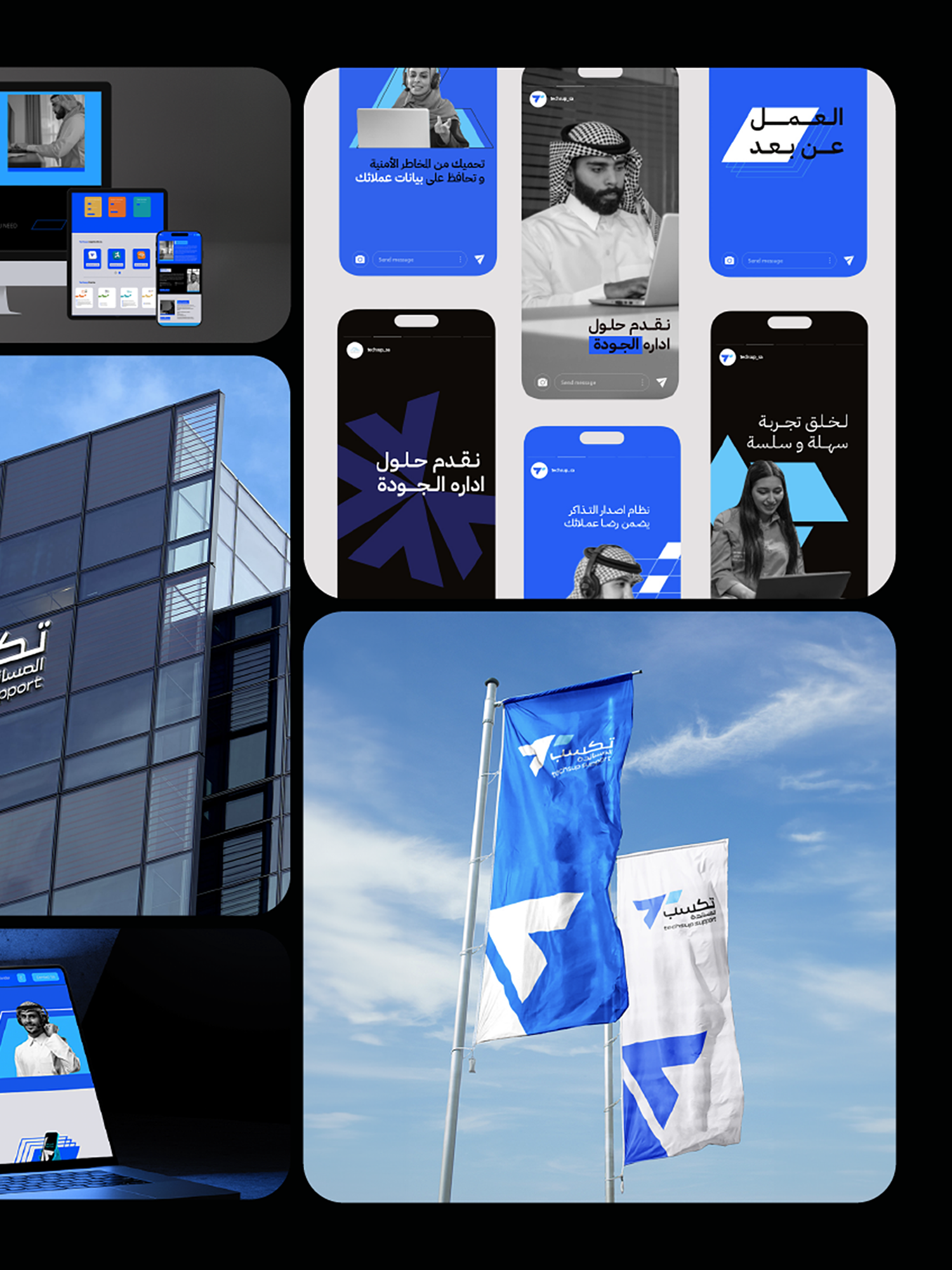
We treated this as a positioning exercise before a design exercise. Before any visual work began, we mapped Techsup's current market position against its aspirational position and identified precisely what the rebrand needed to communicate: professional capability, technological sophistication, and the credibility to operate at enterprise scale. The new identity was engineered to shift perception — signalling to the market that Techsup had arrived as a serious contender for large-scale contracts.
( Project Scope )
Leading the full strategic rebranding of Techsup — repositioning a growing call center and business support company to reflect its expanded capabilities and enterprise-level ambitions.
( Challenges )
Rebranding an operational business without disrupting client relationships or team confidence required careful navigation. These were the core tensions:
(Results )
Techsup's rebrand aligned its external identity with its operational reality — opening conversations at the enterprise level that the previous brand was quietly closing.
one ls--default--none" >
ontent/uploads/sites/2/2025/10/test_avatar_7.webp">
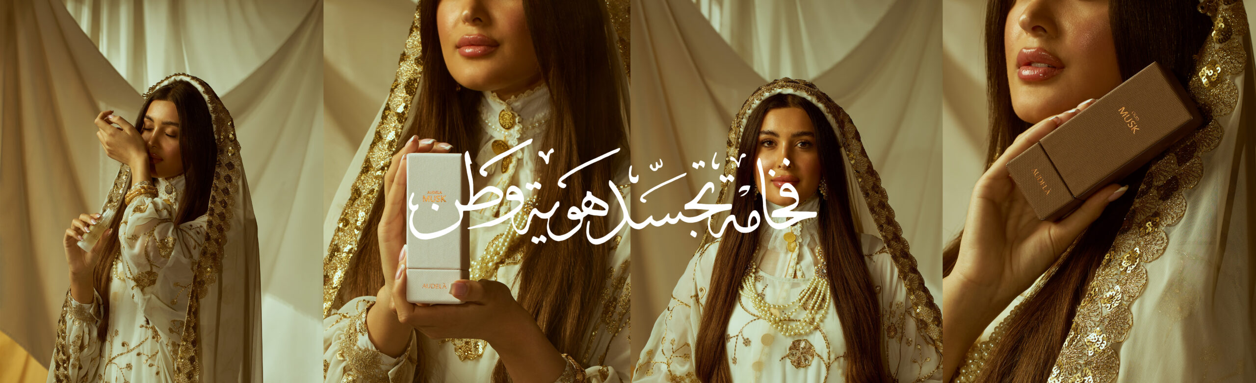
We developed a creative concept that connected Audela's brand narrative to the thematic core of Founding Day — origins, identity, and the act of building something lasting. Rather than reaching for stock heritage imagery or generic patriotic colour washes, we created original visual content that wove Audela's aesthetic into the cultural moment with intelligence and craft. The result was content that felt both genuinely patriotic and distinctly branded.
( Project Scope )
Developing and producing Audela's Saudi Founding Day 2025 campaign — a content series that connected the brand's identity to the national occasion with genuine creative ambition, not generic patriotic visuals.
( Challenges )
Founding Day generates a flood of branded content from every sector — standing out requires more than a logo in Saudi green. These were our creative constraints:
(Results )
Audela's Founding Day campaign stood apart from the volume of generic branded content — earning real engagement from a Saudi audience that rewards creative authenticity.
one ls--default--none" >
ontent/uploads/sites/2/2025/10/test_avatar_7.webp">
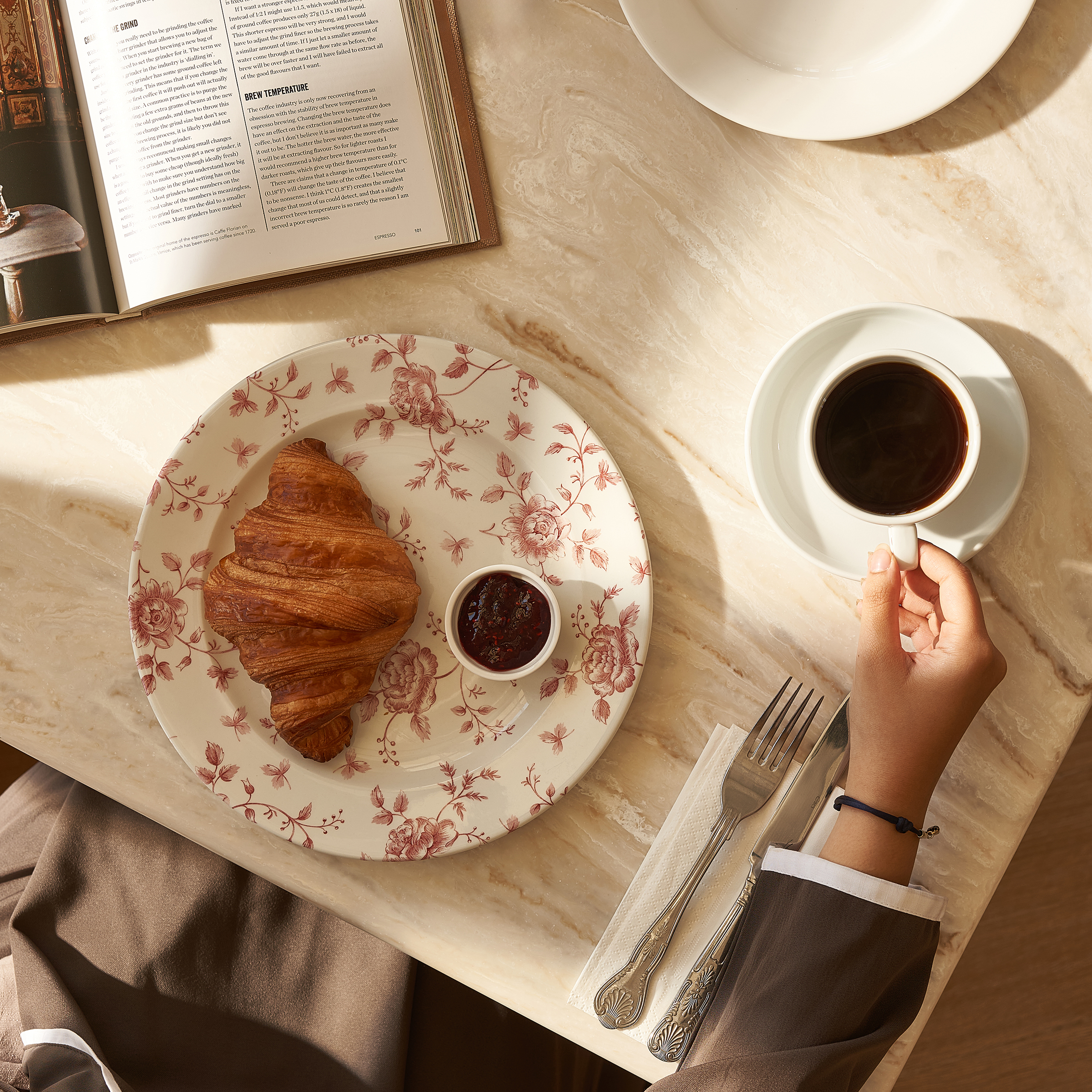
We approached the Buttermilk shoot with an editorial sensibility — treating each frame as a piece of content that needed to earn its place in a highly competitive F&B feed. Composition, styling, and colour grading were all calibrated for Instagram and social platform performance: mood-driven but commercially sharp, atmospheric but never at the expense of product clarity. The visual identity we established gave Buttermilk a consistent aesthetic they could build an entire content strategy around.
( Project Scope )
Producing a full F&B photography series for Buttermilk's social media — editorial-quality images designed to make their feed a destination in its own right, not just a product showcase.
( Challenges )
Saudi food social media is visually competitive — every F&B brand is investing in photography. Buttermilk needed to go further. Here is what that demanded:
(Results )
Buttermilk's social media feed was transformed from a standard F&B account into a visually distinct presence that their audience actively follows for the content itself.
one ls--default--none" >
ontent/uploads/sites/2/2025/10/test_avatar_7.webp">
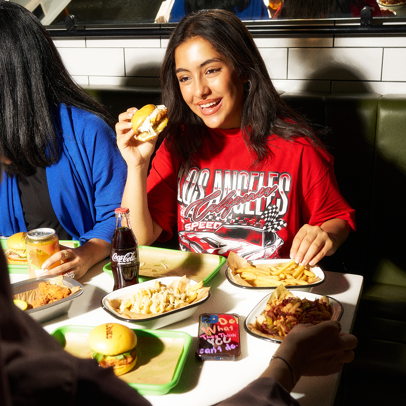
Lifestyle photography lives or dies by the quality of its pre-production — the casting, the location, the styling, and the creative direction that happens before the camera appears. We invested heavily at this stage, developing a visual concept that was authentic to the Arnies brand and appealing to their Saudi audience. On shoot day, the preparation paid off: every element was in place for a focused, productive session that produced the breadth and depth of imagery the brand needed.
( Project Scope )
Executing a full lifestyle photography production for Arnies — brand imagery that communicates attitude, identity, and aspiration rather than simply documenting product.
( Challenges )
Lifestyle photography is decided before the camera appears — in the brief, the casting, and the location. These were the production challenges we had to solve:
(Results )
Arnies emerged from the shoot with a brand image library that gave them the visual currency to compete confidently at the premium end of their category.
one ls--default--none" >
ontent/uploads/sites/2/2025/10/test_avatar_7.webp">
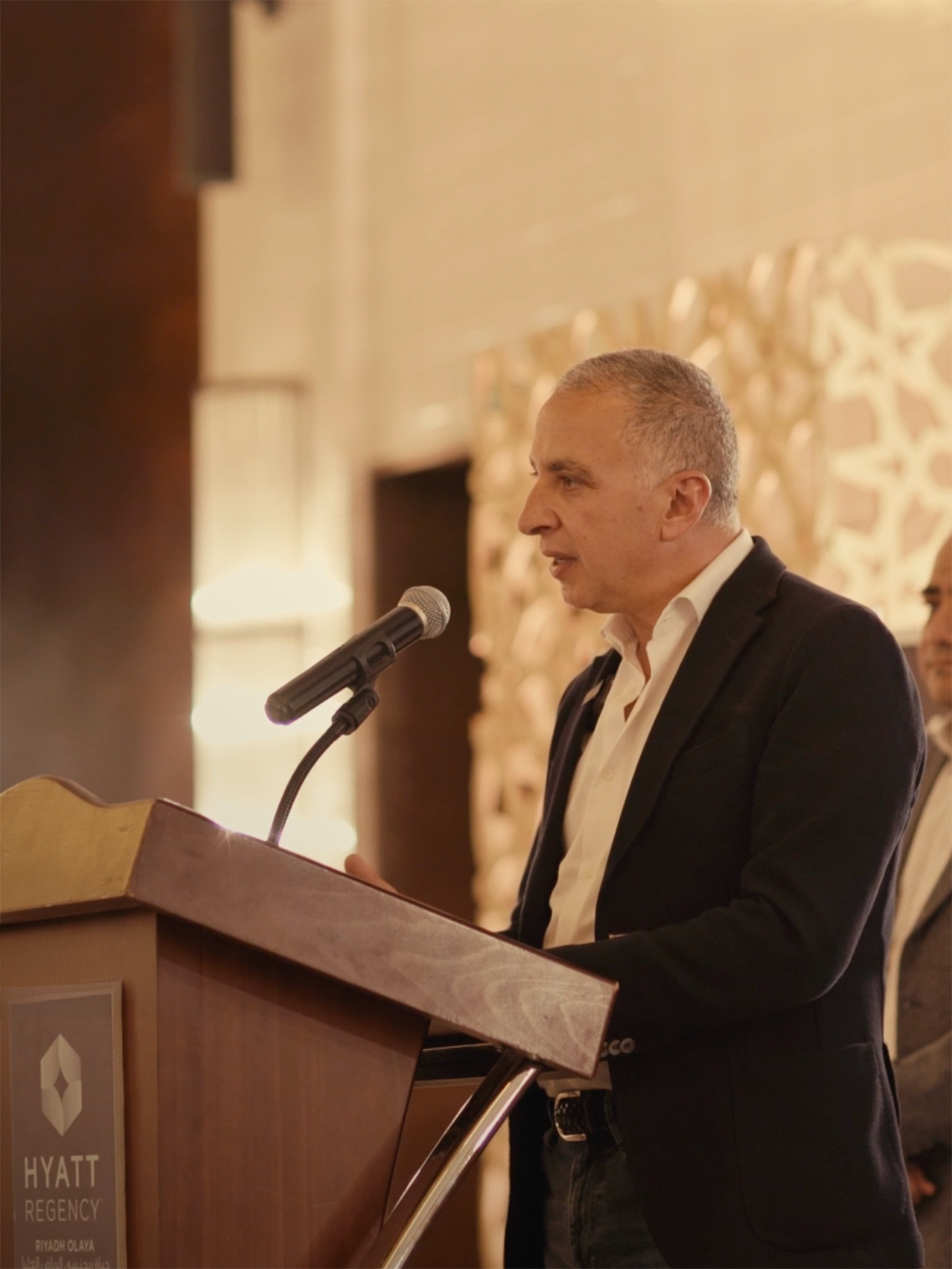
Corporate Iftar coverage demands a particular sensibility — the ability to document an event with journalistic thoroughness while maintaining the warmth and dignity that Ramadan occasions call for. We deployed a coordinated photo and video team capable of working unobtrusively among senior guests while still capturing the full narrative arc of the evening: the welcome, the shared meal, the conversations that matter most in relationship-driven Saudi business culture.
( Project Scope )
Providing professional photo and video event coverage for ElSewedy Electric's corporate Ramadan Iftar gathering in Saudi Arabia — a significant moment for both internal and external communications.
( Challenges )
Corporate Ramadan events carry cultural significance that demands a particular approach from any production team. These were the requirements we had to meet:
(Results )
ElSewedy Electric received a complete, polished record of their Ramadan Iftar — content that honoured the occasion and provided genuine value for corporate communications throughout the year.
one ls--default--none" >
ontent/uploads/sites/2/2025/10/test_avatar_7.webp">
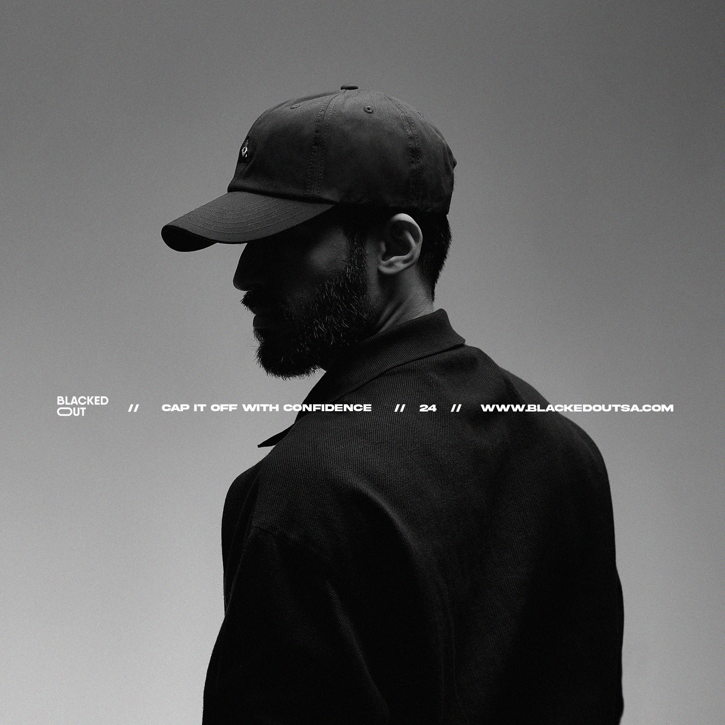
Fashion photography for social media operates at the intersection of commerce and culture — it has to make product desirable while simultaneously constructing a brand universe that followers want to inhabit. We developed a visual direction rooted in Blackedout's core aesthetic: clean, dark, precise. Every compositional and styling choice reinforced the brand's identity. The result was a library of images with a coherent visual fingerprint — the kind of consistency that builds real brand recognition over time.
( Project Scope )
Producing fashion and lifestyle photography for Blackedout's social media presence — a visual identity shoot designed to communicate the brand's aesthetic with editorial confidence.
( Challenges )
Fashion photography for social media is commercial and editorial simultaneously — and the Saudi market has its own distinct visual expectations. These were the tensions we navigated:
(Results )
Blackedout's social media presence gained a visual identity as sharp and distinctive as the brand itself — photography that finally made the aesthetic statement the brand had always been building toward.
one ls--default--none" >
ontent/uploads/sites/2/2025/10/test_avatar_7.webp">