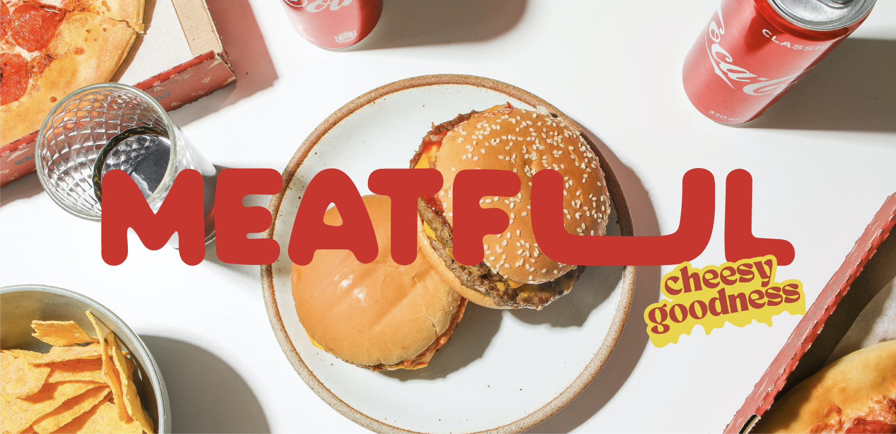
We leaned into Meatful's personality from the first briefing session — this wasn't a brand that called for restraint. The creative direction centred on confident, high-energy visual language: assertive typography, a colour palette that communicates appetite and intensity, and graphic elements with enough boldness to stand out in a saturated feed. Every decision was made with the Saudi market's visual literacy in mind — an audience that has seen every generic food brand template and responds to something that genuinely has character.


 ontent/uploads/sites/2/2025/10/test_avatar_7.webp">