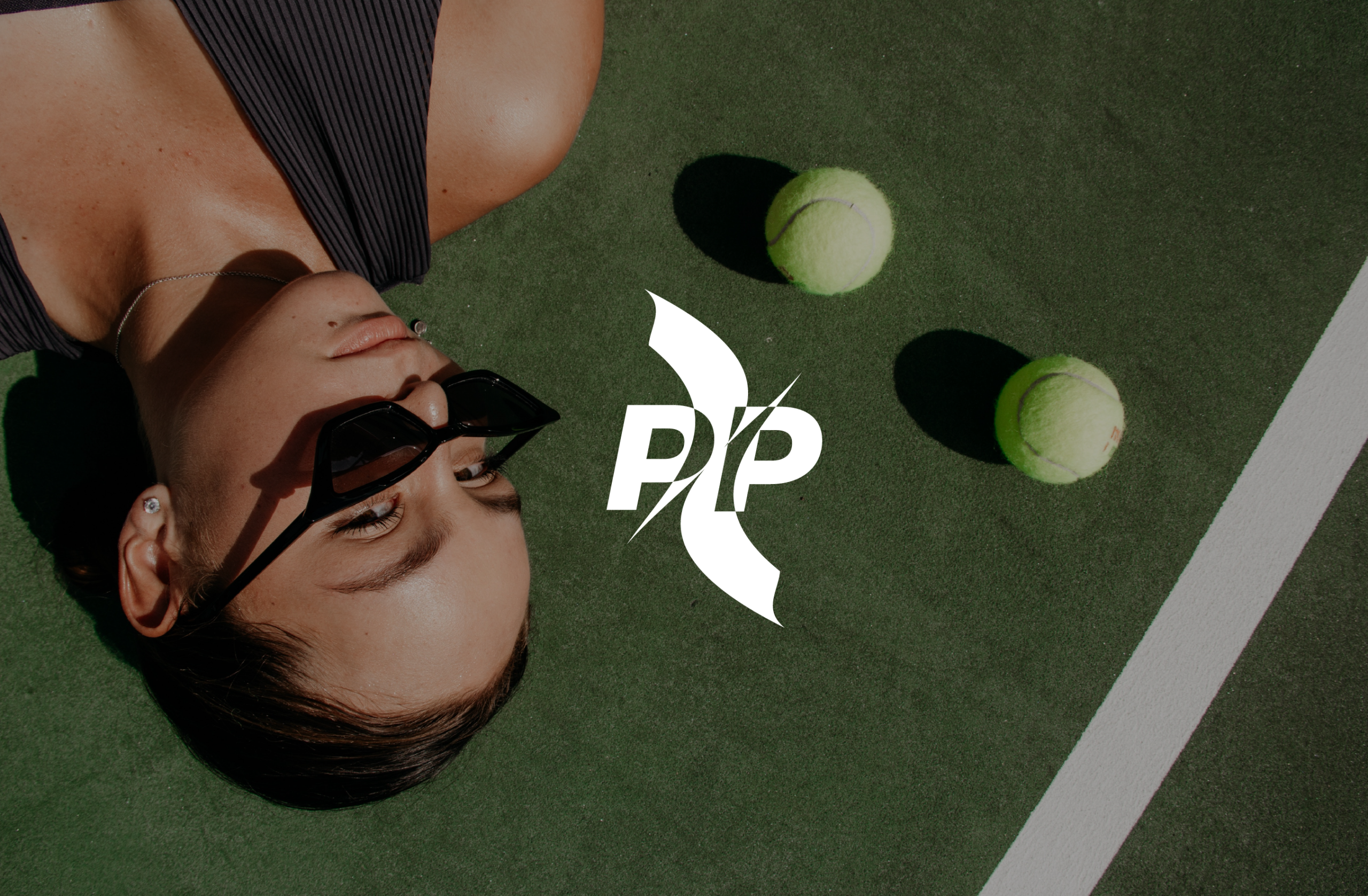




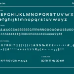



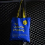
We researched the Saudi padel community before touching a single design element — understanding what drives participation, what brands the community already respects, and where the visual white space existed. The creative direction landed at the intersection of sport precision and lifestyle confidence: dynamic enough for the court, polished enough for the feed. Graphic elements drew from the geometry of padel itself, and the colour system was chosen to communicate speed, energy, and premium quality simultaneously.
( Project Scope )
Creating the brand identity for Padel Pulse — a lifestyle and sports brand built at the intersection of Saudi Arabia's fastest-growing recreational community and premium streetwear aesthetics.
( Challenges )
Padel sits at the intersection of elite sport and social lifestyle — the brand had to be credible in both worlds. Here is what that required:
(Results )
Padel Pulse launched with a brand identity the community immediately took seriously — a voice that felt native to Saudi padel culture from the very first post.
one ls--default--none" >
ontent/uploads/sites/2/2025/10/test_avatar_7.webp">

We approached this as a brand-building exercise, not just a product shoot. Before the camera was pointed at a single item, we developed a creative direction that defined the colour language, lighting aesthetic, and compositional style Pixie would own on social media. Execution covered both flat lay product arrangements and lifestyle-driven content that placed the products within the daily rituals of a modern Saudi woman.
( Project Scope )
( Challenges )
Pixie was a new brand with no established visual identity — which meant every creative decision, from surface materials to colour language, had to be made from scratch. There was no existing photography to reference or maintain consistency with, so we had to build the entire visual system in a single session. Photographing beauty and skincare products for the Saudi market also requires sensitivity to local aesthetics: packaging is often multilingual, and the imagery needs to resonate with a young, digitally native Saudi audience who can immediately tell the difference between aspirational content and generic stock-style photography. The brief also required the library to be large enough to sustain weeks of publishing from a single shoot — meaning every frame had to earn its place.
(Results )
Pixie launched their Instagram presence with a complete visual toolkit — flat lays, lifestyle compositions, and close-up detail shots that together created a feed aesthetic coherent enough to be mistaken for a brand with years of content history. The photography library provided enough content to sustain several months of consistent posting without creative repetition. More importantly, it gave Pixie's team a clear visual language to brief future content against — a brand standard set from day one.
one ls--default--none" >
ontent/uploads/sites/2/2025/10/test_avatar_7.webp">
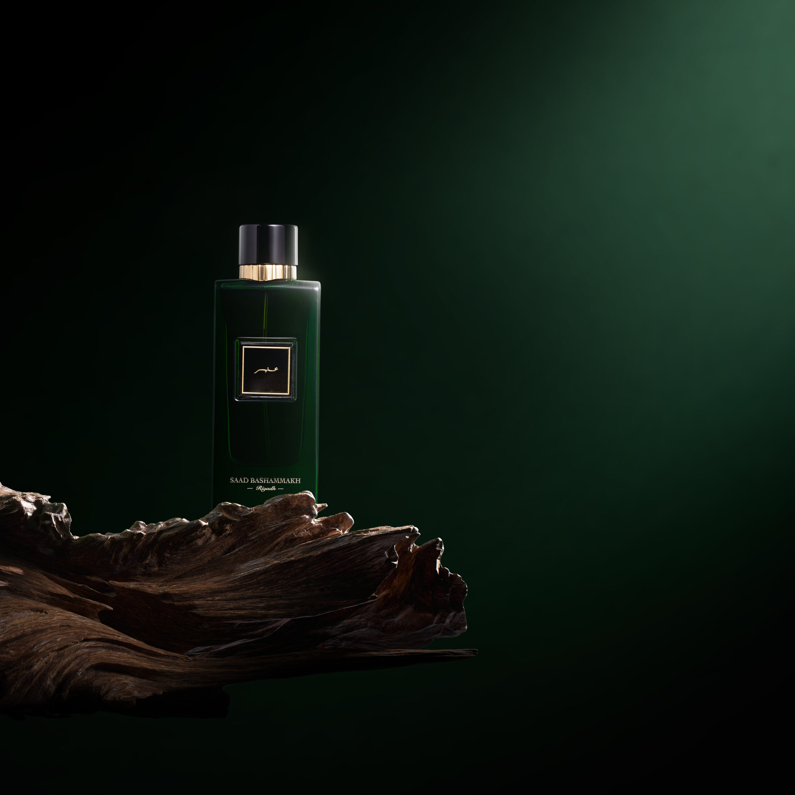
We developed a social media creative direction that complemented the existing website imagery without duplicating it — giving Bashammakh two distinct but coherent visual identities for two different platforms. The social shoot introduced environmental context, texture, and lifestyle elements that the website photography deliberately excluded, creating content that worked on Instagram's terms while maintaining the brand's premium positioning.
( Project Scope )
( Challenges )
The key challenge was differentiation: Bashammakh already had a professional photography library from the earlier website engagement. The social media shoot needed to produce imagery that was distinctly different in feel and purpose — lifestyle-oriented rather than e-commerce — while remaining visually coherent with the existing brand presentation. Producing two different but related visual identities for the same products required disciplined creative direction. Using the same items photographed differently risks looking inconsistent if the two visual languages drift too far apart or too close together. The social content also needed to be adapted for the fast-scroll environment of Instagram and Snapchat — compositions and colour treatments designed to stop the thumb, not simply present the product cleanly.
(Results )
Bashammakh now operates with two purpose-built photography libraries: a clean, conversion-focused set for the website and a dynamic, context-rich set for social media. Together they present a brand that looks deliberate and premium across every touchpoint. The social photography gave the brand's channels a noticeable visual upgrade, with the lifestyle-oriented content generating stronger engagement than product-only posts — demonstrating that context and storytelling drive social performance in a way that straight product shots rarely do. The project also strengthened the ongoing relationship with the client, confirming Ideative Studio as Bashammakh's trusted creative partner across multiple production formats.
one ls--default--none" >
ontent/uploads/sites/2/2025/10/test_avatar_7.webp">