


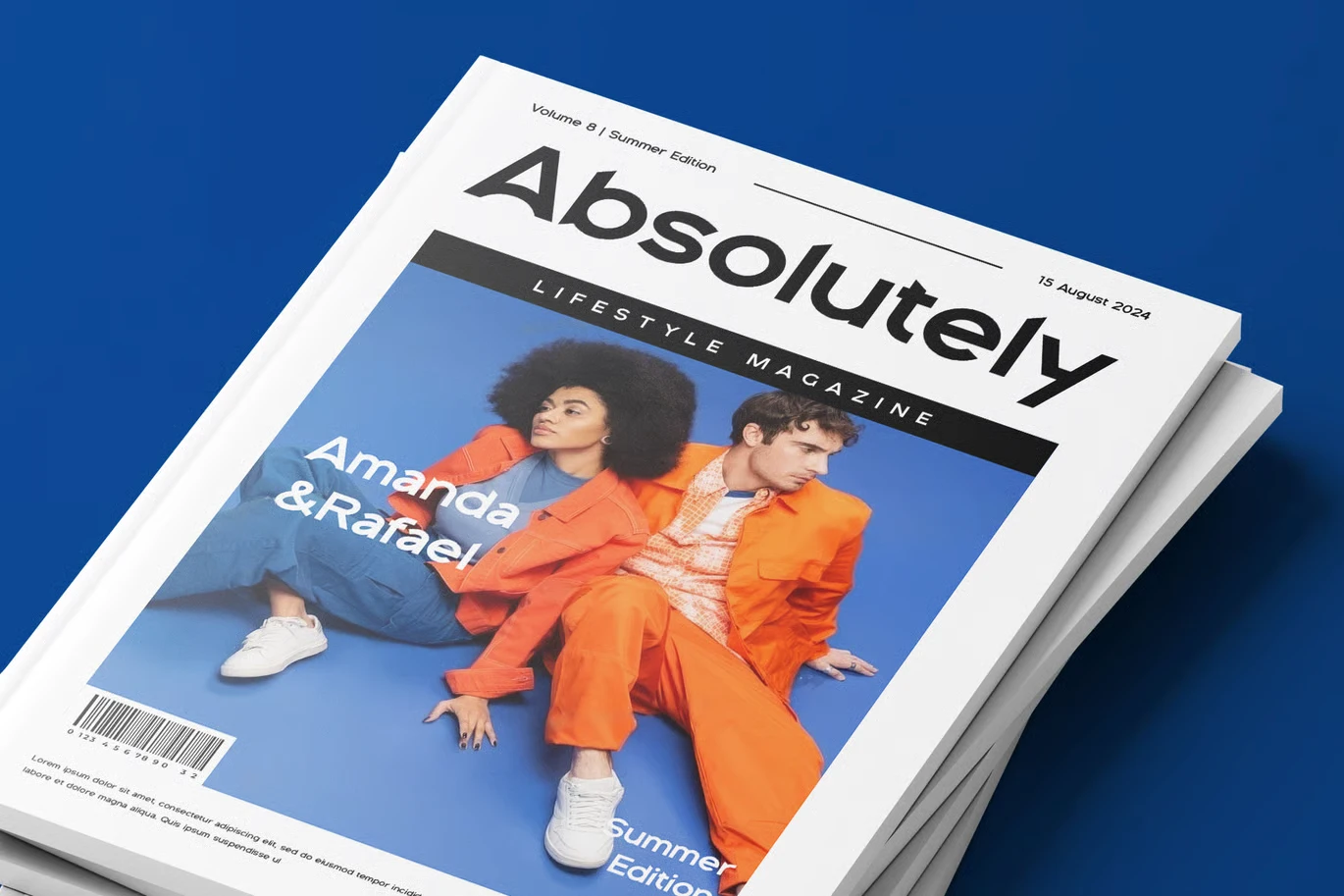
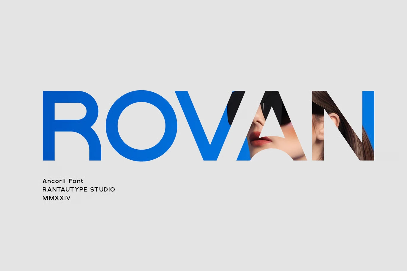
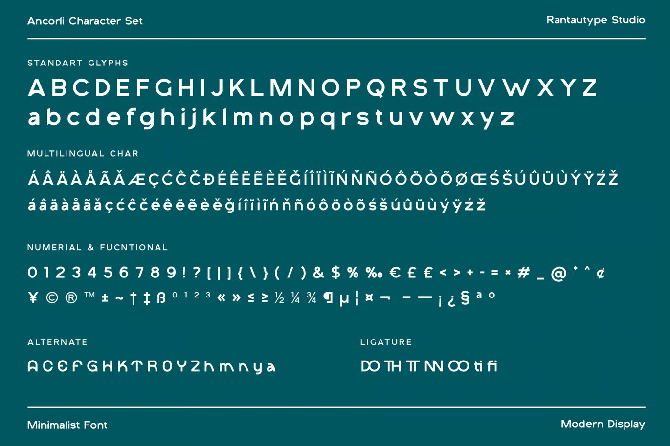

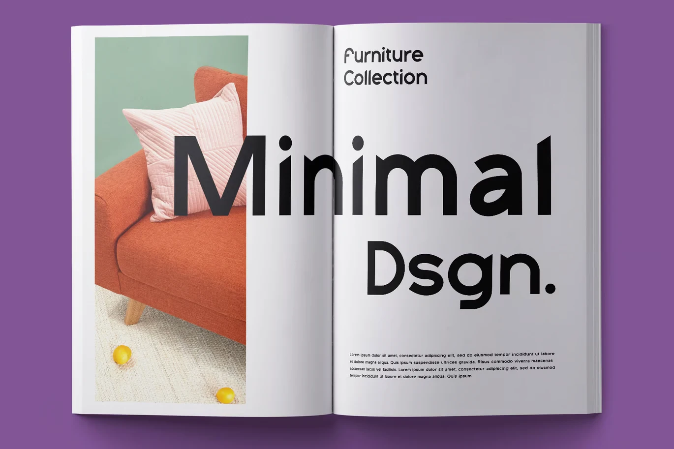



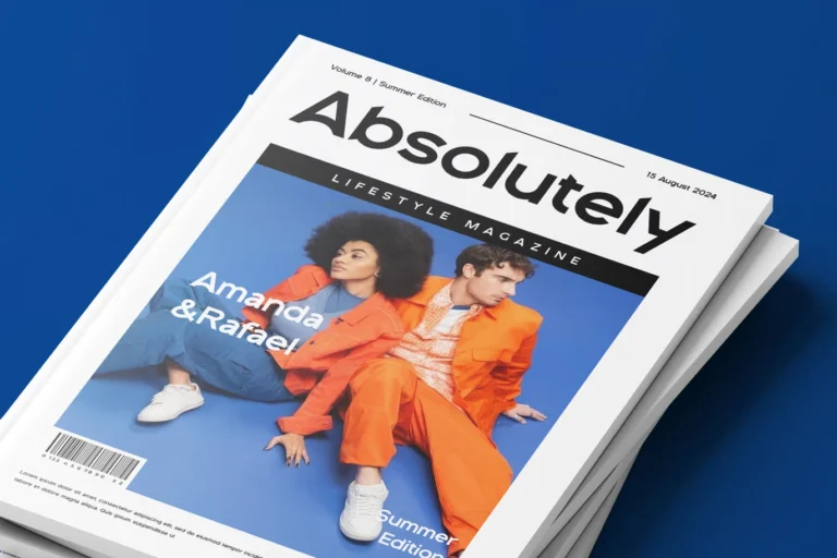
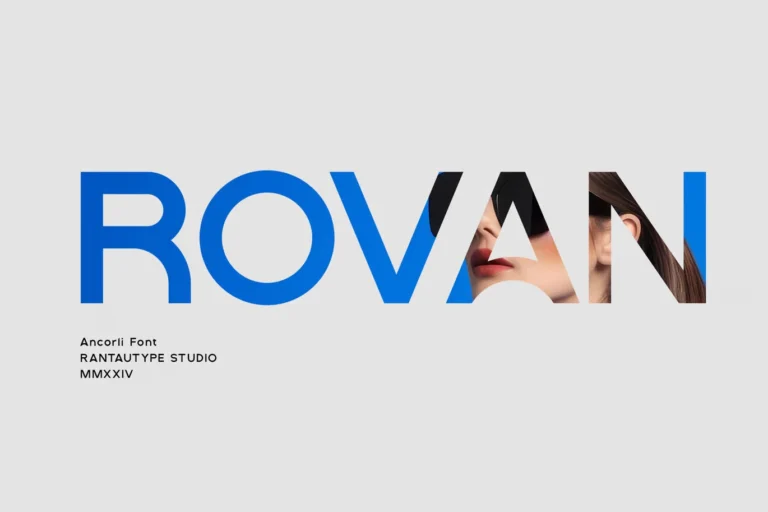


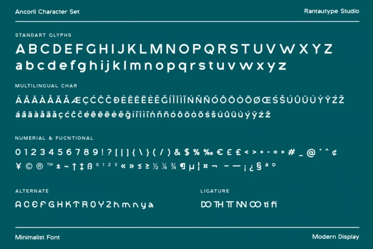


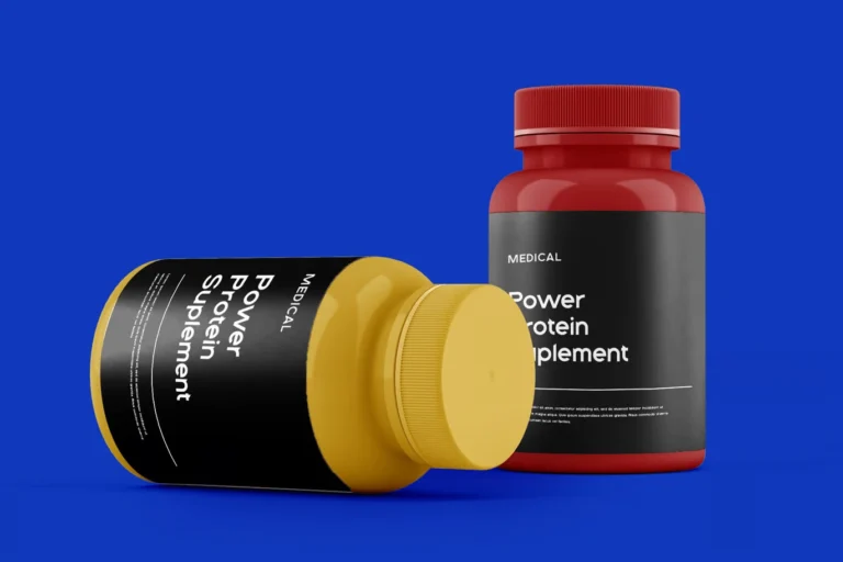








Ideative approached the rebrand as a brand-building exercise first and a design exercise second. We began with a discovery phase to understand the competitive landscape, target audience, and long-term business direction before a single mark was sketched. The outcome is a cohesive identity system built to scale — consistent across digital, print, environments, and communications.
( Project Scope )
( Challenges )
Every project presents its own complexities. Here is what we navigated:
(Results )
Audela launched its new identity to immediate market recognition — the rebrand became the visual foundation for the brand's next growth phase.
one ls--default--none" >
ontent/uploads/sites/2/2025/10/test_avatar_7.webp">

Ideative took full creative ownership of MATCH’s visual presence — developing the creative direction, managing casting, and executing production across photography, video, and social media. The team delivered end-to-end from concept through retouching, ensuring every asset met the premium standard the beauty industry demands.
( Project Scope )
( Challenges )
Every project presents its own complexities. Here is what we navigated:
(Results )
MATCH Beauty's social presence transformed from inconsistent to unmistakably premium — content that builds brand and drives sales simultaneously.
one ls--default--none" >
ontent/uploads/sites/2/2025/10/test_avatar_7.webp">

Sports event coverage requires a different production discipline than brand shoots: the action is unpredictable, the light changes constantly, and the story is made in real time. Ideative deployed an experienced sports production team for all four days, structured around a morning-to-night shooting schedule with same-day turnaround on social media clips and highlights.
( Project Scope )
( Challenges )
Every project presents its own complexities. Here is what we navigated:
(Results )
The Vitality Tournament lived on well beyond its final match — Ideative's content gave Padel Rush a complete visual record and a social media campaign in one.
one ls--default--none" >
ontent/uploads/sites/2/2025/10/test_avatar_7.webp">
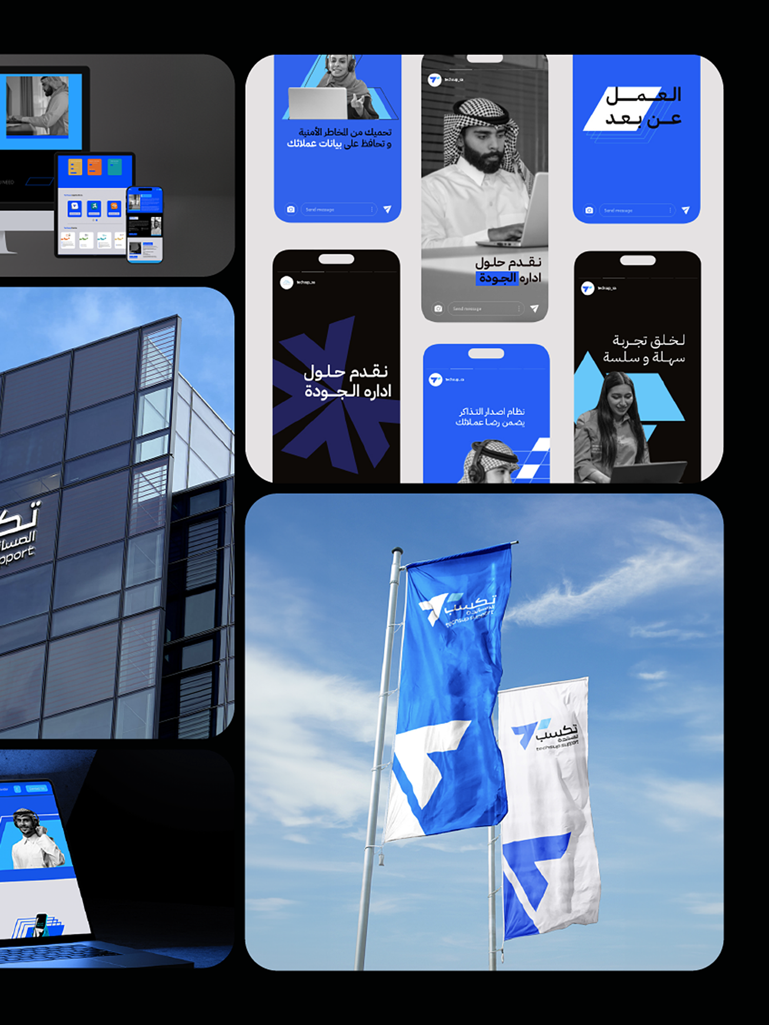
We treated this as a positioning exercise before a design exercise. Before any visual work began, we mapped Techsup's current market position against its aspirational position and identified precisely what the rebrand needed to communicate: professional capability, technological sophistication, and the credibility to operate at enterprise scale. The new identity was engineered to shift perception — signalling to the market that Techsup had arrived as a serious contender for large-scale contracts.
( Project Scope )
Leading the full strategic rebranding of Techsup — repositioning a growing call center and business support company to reflect its expanded capabilities and enterprise-level ambitions.
( Challenges )
Rebranding an operational business without disrupting client relationships or team confidence required careful navigation. These were the core tensions:
(Results )
Techsup's rebrand aligned its external identity with its operational reality — opening conversations at the enterprise level that the previous brand was quietly closing.
one ls--default--none" >
ontent/uploads/sites/2/2025/10/test_avatar_7.webp">