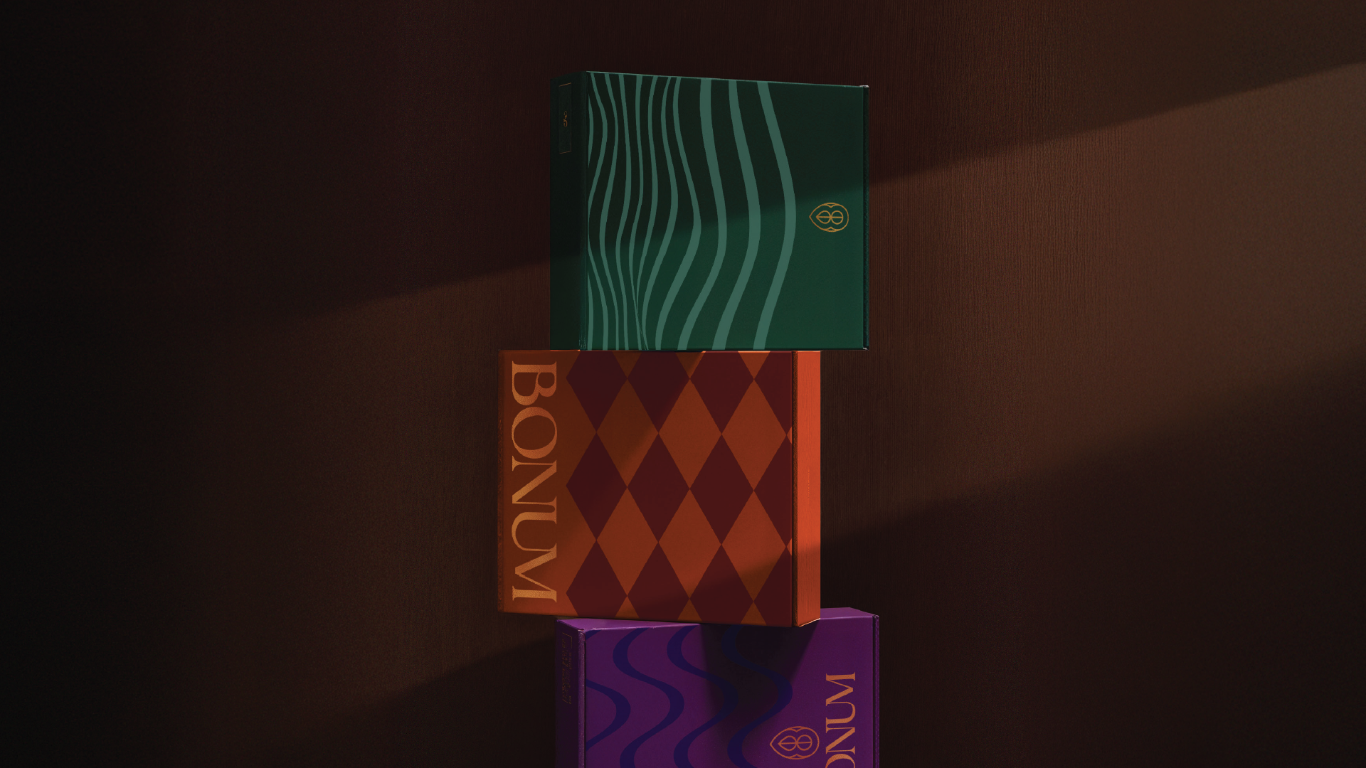



Luxury chocolate branding in Saudi Arabia demands a specific kind of restraint: the identity must communicate indulgence, craftsmanship, and heritage without visual noise. Ideative grounded the redesign in a considered aesthetic — refined typography, a sophisticated color system, and packaging architecture designed to elevate the unboxing experience as much as the product itself.
( Project Scope )
( Challenges )
Every project presents its own complexities. Here is what we navigated:
(Results )
Bonum Chocolates emerged from the rebrand with a luxury identity that earns its premium positioning — packaging that sells the product before the customer tastes it.
one ls--default--none" >
ontent/uploads/sites/2/2025/10/test_avatar_7.webp">
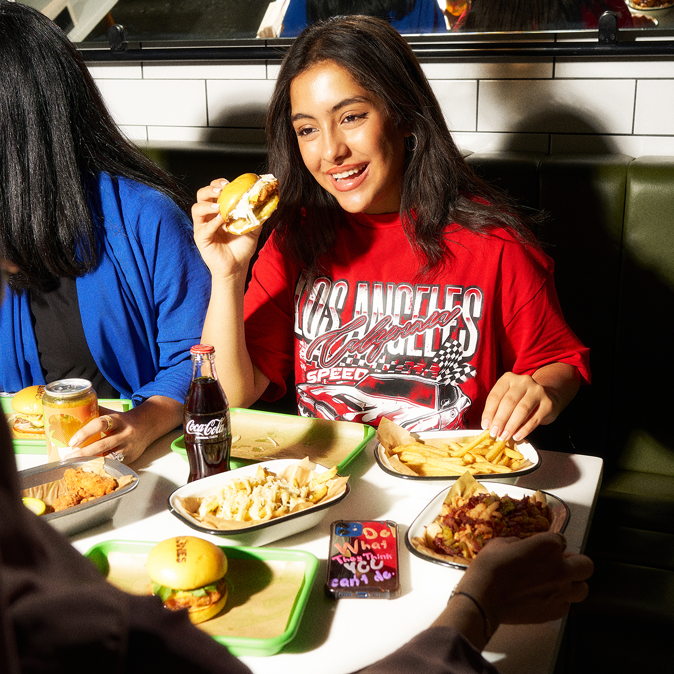
Lifestyle photography lives or dies by the quality of its pre-production — the casting, the location, the styling, and the creative direction that happens before the camera appears. We invested heavily at this stage, developing a visual concept that was authentic to the Arnies brand and appealing to their Saudi audience. On shoot day, the preparation paid off: every element was in place for a focused, productive session that produced the breadth and depth of imagery the brand needed.
( Project Scope )
Executing a full lifestyle photography production for Arnies — brand imagery that communicates attitude, identity, and aspiration rather than simply documenting product.
( Challenges )
Lifestyle photography is decided before the camera appears — in the brief, the casting, and the location. These were the production challenges we had to solve:
(Results )
Arnies emerged from the shoot with a brand image library that gave them the visual currency to compete confidently at the premium end of their category.
one ls--default--none" >
ontent/uploads/sites/2/2025/10/test_avatar_7.webp">
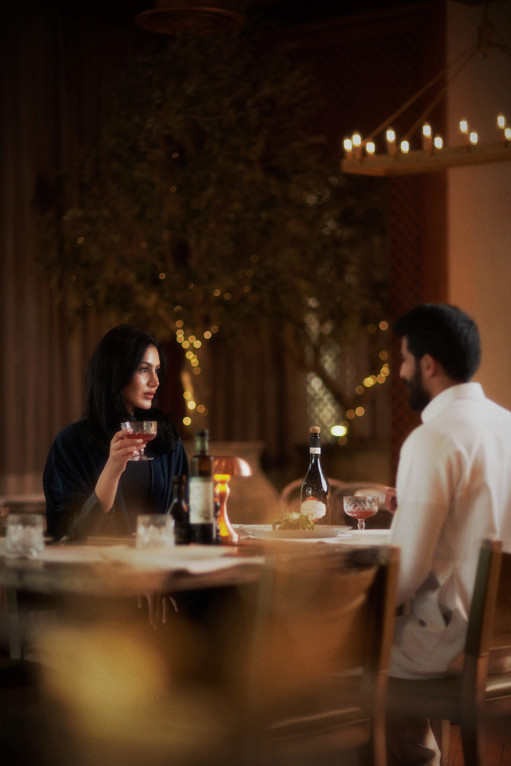
We treated the shoot as a visual storytelling exercise. Altopiano's identity is built on quality ingredients, careful preparation, and a warm atmosphere that sets it apart from the Riyadh dining crowd — and the photography had to communicate all three without a single word. We designed lighting setups that brought out the warmth of each dish, and styled every composition to emphasise the care and detail that Altopiano puts into its food.
( Project Scope )
( Challenges )
Food photography for a premium restaurant carries a specific technical difficulty: food does not hold its ideal appearance under studio conditions for long. Timing, speed, and precision are essential — every dish needs to be plated, styled, and shot within minutes before heat and humidity alter textures and colours. Altopiano's Italian-inspired menu presented an additional challenge: the dishes needed to look authentically European in craft while appealing to a Saudi dining audience accustomed to seeing a high standard of food content across social media. The client's warm restaurant lighting created a visual atmosphere that had to be balanced against the requirements of social media photography — which demands more contrast, brightness, and pop than a restaurant's ambient environment naturally provides.
(Results )
Altopiano received a complete social media photography library covering their core menu — starters, mains, desserts, and beverages — with a consistent aesthetic that unified the feed and elevated the brand's perceived quality across Instagram. The imagery deployed immediately drove measurable increases in content engagement and, according to the client, translated directly into reservations from customers who had discovered the restaurant through its social media presence. The shoot also gave Altopiano's marketing team a backlog of high-quality assets, removing the pressure of ad-hoc food photography and enabling a more strategic, planned publishing cadence.
one ls--default--none" >
ontent/uploads/sites/2/2025/10/test_avatar_7.webp">
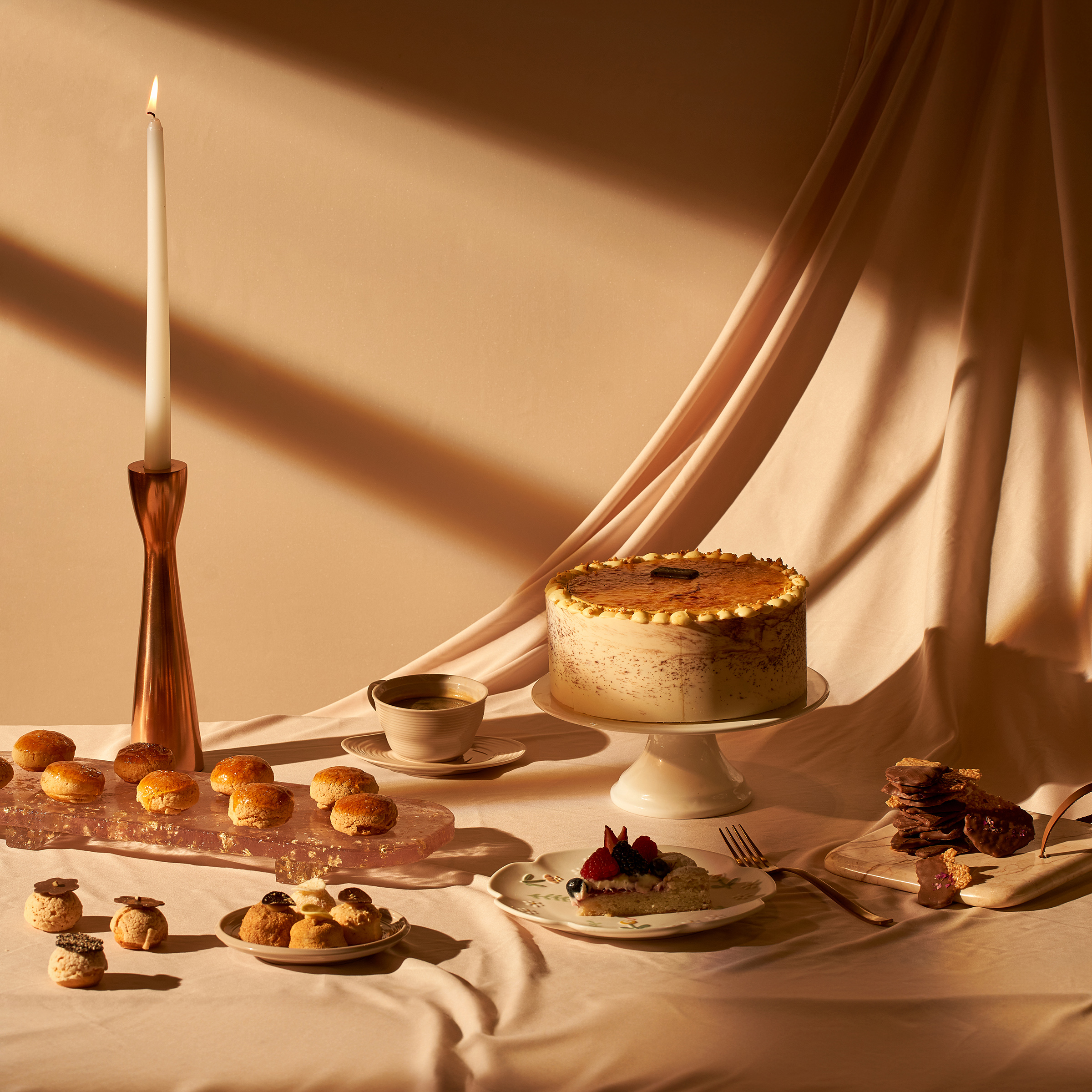
We entered Session 2 with a significant advantage: an established visual system. The colour grading profile, lighting ratios, surface materials, and compositional rules from Session 1 were codified and applied as production standards from the first frame. This allowed the creative team to focus on introducing variation and freshness within the existing framework — expanding the library's versatility without fracturing the brand's visual coherence.
( Project Scope )
( Challenges )
The primary challenge of Session 2 was continuity: all new imagery had to be visually indistinguishable from Session 1 content when published side by side in a feed. Audiences should never be able to identify which image came from which production session — that seamlessness requires precise documentation and discipline. New product introductions brought packaging, colourways, and form factors that had not featured in Session 1 — each requiring thoughtful integration into the existing visual system without forcing them into a mould that did not suit them. Seasonal content requirements added another layer: some of the new imagery needed to reflect specific product moments and themes distinct from the foundational library, while still reading as Pixie content.
(Results )
Session 2 doubled the size of Pixie's content library while maintaining complete visual continuity with Session 1 — an outcome that required both creative discipline and rigorous production standards. The expanded library extended Pixie's social media publishing runway significantly, enabling the brand to maintain a consistent, high-quality feed without returning to production for an extended period. The cumulative effect of both sessions is a brand that presents itself as established and visually coherent on social media — a perception that has a direct impact on consumer confidence in a competitive Saudi beauty market.
one ls--default--none" >
ontent/uploads/sites/2/2025/10/test_avatar_7.webp">